
An introduction to partial least squares discriminant analysis (PLSDA)
The curse (or challenges) of dimensionality (p>>n)
In this current era of big data, high-dimensional data are everywhere. High-dimensional data can be hard to deal with for some or all of the following reasons.
-
Hard to visualize
-
Samples are sparsely populated in high dimensional spaces
-
Samples are also roughly equidistant from each other in high dimensional spaces
-
Irrelevant features (feature selection)
-
Require intense computational resources
-
…
Let’s simulate some data to illustrate the 2nd and 3rd points.
1
2
3
4
5
6
7
8
9
10
11
12
13
14
15
16
17
18
19
20
21
22
23
24
25
26
27
28
29
30
31
32
33
34
35
36
37
38
39
40
41
42
43
44
# set.seed(1234)
#
# # dimension vector
# num_dim <- c(1, 10, 50, 100, 250, 500, 1000, 2500, 5000, 10000)
# # number of dimensions
# n <- length(num_dim)
#
# # initialize the pair-wise distance vector
# pair_dist_mean <- array(0, c(n, 1))
# pair_dist_range <- array(0, c(n, 1))
#
#
# # create a for loop to sample 100 data points from a n-dimensional (n=1 to 100) standard multivariate normal distribution
# # and calculate the mean and range of pairwise distance and plot them against the (log) number of dimensions
# tic <- Sys.time()
#
# for (i in 1:n) {
#   mu <- numeric(num_dim[i])
#
#   sigma <- diag(num_dim[i])
#
#   data <- mvrnorm(n = 100, mu, sigma)
#
#   pair_dist_v <- dist(data)
#
#   pair_dist_mean[i, 1] <- mean(pair_dist_v)
#
#   pair_dist_range[i, 1] <- (max(pair_dist_v) - min(pair_dist_v)) / max(pair_dist_v)
# }
#
# simdata <- data.frame(num_dim, pair_dist_mean, pair_dist_range)
#
# colnames(simdata) <- c("num_dim", "pairwise_dist_mean", "pairwise_dist_range")
#
# simdata$name <- rep("simulation", n)

# toc <- Sys.time()

# duration <- toc - tic

# duration

# to save some runtime, I will just load the dataset that has been saved
load("./sim_real_data.RData")
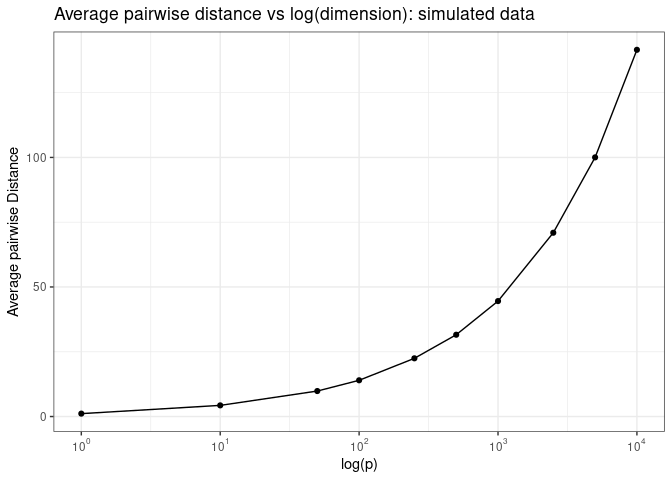
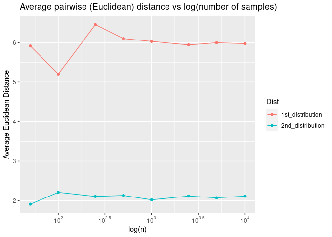
If we plot the average pairwise Euclidean distance as a function of the log of the number of dimensions, we see that the average pairwise distance increases exponentially as a function of log of number of dimensions.
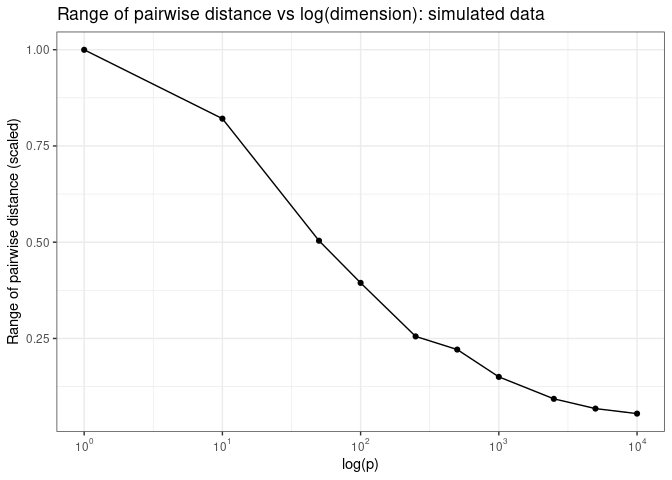
Now what do we mean by “samples are roughly equal distant from each other in high dimensional spaces? Let’s plot pairwise Euclidean distance as a function of log of the number of dimensions
Do we observe these phenomena in real data sets? Or are they just the characteristics of the simulation data from this contrived example?
1
2
3
4
5
6
7
8
9
10
11
12
13
14
15
16
17
18
19
20
21
22
23
24
25
26
27
28
29
30
31
32
33
34
35
36
37
38
39
40
41
42
43
44
45
46
47
48
49
50
# read in the real data frame

# plsda_tutorial_data <- read_csv("plsda_tutorial_data.csv",
#     col_names = FALSE)
#
# plsda_tutorial_data <- as.data.frame(plsda_tutorial_data)
#
# plsda_feature <- subset(plsda_tutorial_data[2:101, 1:10003], select = -c(1, 10002, 10003))


# set.seed(1234)
#
# # dimension vector
# num_dim <- c(1, 10, 50, 100, 250, 500, 1000, 2500, 5000, 10000)
# # number of dimensions
# n <- length(num_dim)
#
# # initialize the pair-wise distance vector
# pair_dist_mean_real <- array(0, c(n, 1))
# pair_dist_range_real <- array(0, c(n, 1))
#
#
# for (i in 1:n) {
#   rand_feature <- sample(10000, num_dim[i])
#
#   feature_subset <- subset(plsda_feature, select = c(rand_feature))
#
#   feature_subset_matrix <- data.matrix(feature_subset, rownames.force = NA)
#
#   feature_subset_matrix <- scale(feature_subset_matrix, center = TRUE, scale = TRUE)
#
#   # pair_dist_v<-dist(feature_subset)
#
#
#   pair_dist_v <- dist(feature_subset_matrix)
#
#   pair_dist_mean_real[i, 1] <- mean(pair_dist_v)
#
#   pair_dist_range_real[i, 1] <- (max(pair_dist_v) - min(pair_dist_v)) / max(pair_dist_v)
# }
#
# realdata <- data.frame(num_dim, pair_dist_mean_real, pair_dist_range_real)
#
#
# colnames(realdata) <- c("num_dim", "pairwise_dist_mean", "pairwise_dist_range")
#
# realdata$name <- rep("real_data", n)
#
#
# sim_real_data <- rbind(simdata, realdata)
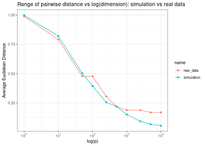
We see the same pattern when we plot the average pairwise distance as a function of log (p)
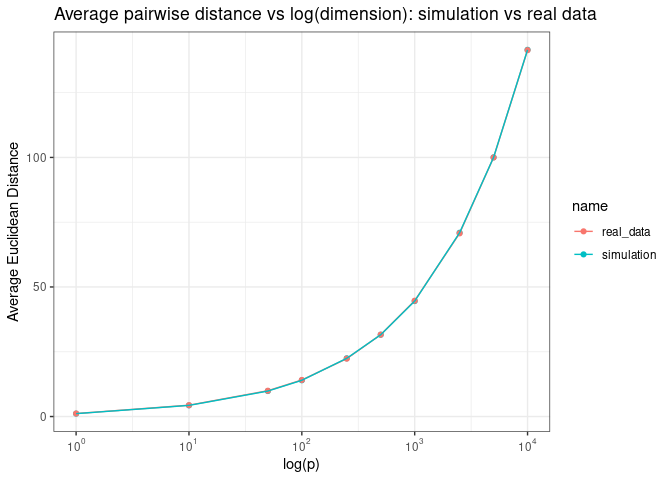
Adn the range of pairwise distance as a function of log (p)
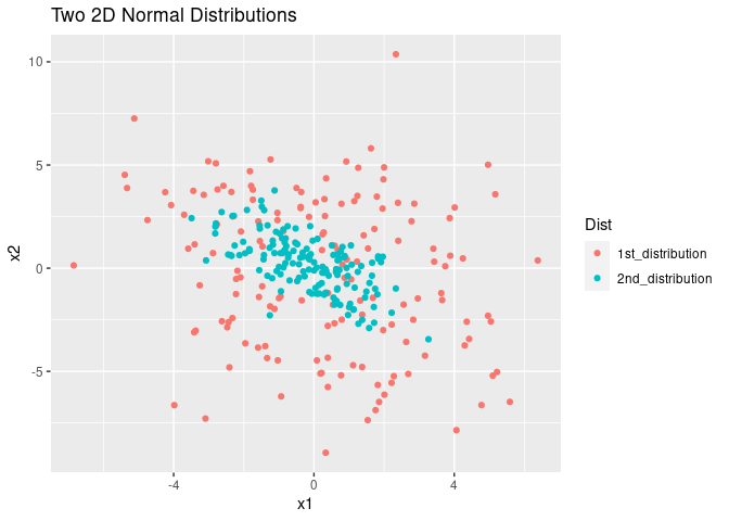
Why might this be a challenge for us? Here I want to offer some intuition about why sparse and equal distant samples might be hard to deal with using the following example. Suppose we have two 2D Gaussian distributions that are distributed like the 1st and 2nd distributions depicted in the figure below. Which distribution, in your opinion, is harder to estimate?
Principal component analysis (pca)
Assumptions in PCA
- Linearity
- Larger variance equals more important “structure” in the dataset
- Components are orthogonal to each other
Algorithms
- Eigendecoposition of the covariance matrix (X’X)
- SVD of the dataset itself svd(X)
- NIPALS algorithm
An example
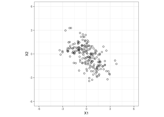
Let’s go back to the 2nd distribution from the example above.
1
## [1] -0.5626172
Let’s use PCA to do dimensionality reduction
1
2
3
4
5
6
dist2_pca_results <- pca(fig1_data, ncomp = 2, center = TRUE, scale = FALSE, max.iter = 500, tol = 1e-09, multilevel = NULL)

# plot variance example by each component
# plot(dist2_pca_results)

dist2_pca_results
1
2
3
4
5
6
7
8
9
10
11
12
13
14
15
16
17
18
##   Eigenvalues for the first 2 principal components, see object$sdev^2:
##       PC1       PC2
## 2.9084612 0.8136725
##
##   Proportion of  explained variance for the first 2 principal components, see object$prop_expl_var:
##       PC1            PC2
## 0.7813962      0.2186038
##
##   Cumulative proportion of  explained variance for the first 2 principal components, see object$cum.var:
##       PC1            PC2
## 0.7813962      1.0000000
##
##   Other available components:
##  --------------------
##   loading vectors: see object$rotation
##   Other functions:
##  --------------------
##   plotIndiv, plot, plotVar, selectVar, biplot
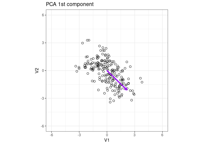
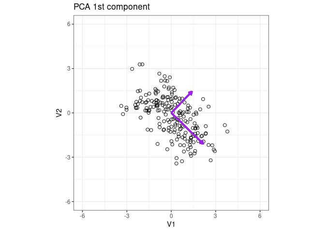
Plot the eigenvector of the 1st PCA component
1
2
3
4
5
x2 <- dist2_pca_results$loadings$X[1, 1]

y2 <- dist2_pca_results$loadings$X[2, 1]

p1 + geom_segment(aes(x = 0, y = 0, xend = x2 * 3, yend = y2 * 3), arrow = arrow(length = unit(0.2, "cm")), color = "purple", lwd = 1) + ggtitle("PCA 1st component")
Add the eigenvector of the 2nd component
1
2
3
4
5
6
x2_2 <- dist2_pca_results$loadings$X[1, 2]

y2_2 <- dist2_pca_results$loadings$X[2, 2]

p1 + geom_segment(aes(x = 0, y = 0, xend = x2*3 , yend = y2*3 ), arrow = arrow(length = unit(0.2, "cm")), color = "purple", lwd = 1) + ggtitle("PCA 1st component")+
geom_segment(aes(x = 0, y = 0, xend = x2_2*2 , yend = y2_2*2 ), arrow = arrow(length = unit(0.2, "cm")), color = "purple", lwd = 1) + ggtitle("PCA 1st component")
1
dist2_pca_results$loadings
1
2
3
4
## $X
##           PC1       PC2
## V1  0.7176986 0.6963539
## V2 -0.6963539 0.7176986
1
cor(dist2_pca_results$variates$X)
1
2
3
##              PC1          PC2
## PC1 1.000000e+00 4.818502e-16
## PC2 4.818502e-16 1.000000e+00
Partial least sqaures discriminant analysis (plsda) as supervised pca
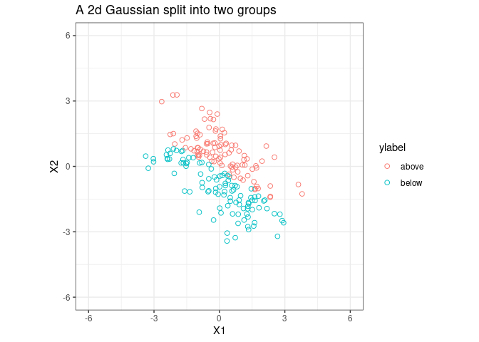
Let’s split the sample into two groups;
1
2
3
4
5
6
7
8
9
10
11
12
13
14
15
16
17
18
19
20
21
22
23
24
25
26
27
28
29
30
31
32
33
34
35
36
37
38
fig1_lm <- lm(V2 ~ V1, fig1_data)

intercept <- fig1_lm$coefficients[1]

slope <- fig1_lm$coefficients[2]

ylabel <- rep("label", 200)

X_1 <- fig1_data$V1
X_2 <- fig1_data$V2


above_or_below <- function(x, y) {
  y - slope * x - intercept
}

# logic is simple but not pretty; maybe more efficient way to do this;
for (i in 1:200) {
  if (above_or_below(X_1[i], X_2[i]) >= 0) {
    ylabel[i] <- "above"
  } else {
    ylabel[i] <- "below"
  }
}


fig1_data$ylabel <- ylabel


p1 <- ggplot(fig1_data, aes(x = V1, y = V2, color = ylabel))+
  geom_point(shape = 1, size = 2) +coord_equal(ratio = 1)+
  theme_bw() +
  xlim(c(-6, 6)) +
  ylim(c(-6, 6))
p1 <- p1 + ggtitle("A 2d Gaussian split into two groups ")
p1 <- p1 + xlab("X1") + ylab("X2")
p1
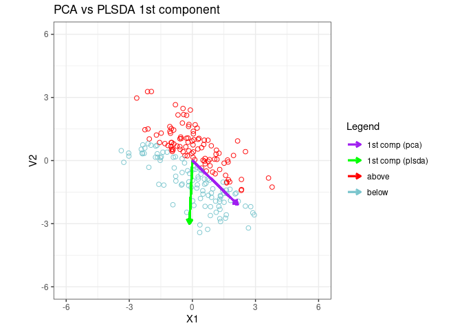
Fit a PLSDA model to data and plot the 1st PLSDA component
fit plsda
1
2
3
4
5
6
7
8
9
10
X<-cbind(fig1_data$V1,fig1_data$V2)

ylabel<-fig1_data$ylabel

plsda_results <- plsda(X, ylabel, ncomp = 2, max.iter = 500)

x2_plsda <- plsda_results$loadings$X[1, 1]
y2_plsda <- plsda_results$loadings$X[2, 1]

plsda_results$prop_expl_var
1
2
3
4
5
6
7
## $X
##     comp1     comp2
## 0.6398512 0.3601488
##
## $Y
##     comp1     comp2
## 1.0000000 0.5579089
1
plsda_results$loadings.star
1
2
3
4
5
6
7
8
9
## [[1]]
##           [,1]       [,2]
## X1 -0.04549507 -1.0258287
## X2 -0.99896456 -0.5443789
##
## [[2]]
##             [,1]       [,2]
## above -0.7071068 -0.7071068
## below  0.7071068  0.7071068
1
#plotIndiv(plsda_results, style ="ggplot2" , ind.names = FALSE,ellipse = TRUE,legend = TRUE)
1
2
3
4
5
6
7
8
9
10
11
12
13
14
15
16
17
18
fig1_data$ylabel <- ylabel

x2_plsda <- plsda_results$loadings$X[1, 1]
y2_plsda <- plsda_results$loadings$X[2, 1]

component_colors<-cbind("1st comp (pca)"="purple","1st comp (plsda)"="green","above"="red","below"="cadetblue3 ")

p1 <- ggplot(fig1_data, aes(x = V1, y = V2,color=ylabel)) +
  geom_point(shape = 1, size = 2,show.legend = FALSE) +coord_equal(ratio = 1)+
  theme_bw() +
  xlim(c(-6, 6)) +
  ylim(c(-6, 6))
p1 <- p1 + ggtitle("PCA vs PLSDA 1st component")

p1 + geom_segment(aes(x = 0, y = 0, xend = x2_plsda * 3, yend = y2_plsda *3, color="1st comp (plsda)"),
  arrow = arrow(length = unit(0.2, "cm")), lwd = 1
) +
  geom_segment(aes(x = 0, y = 0, xend = x2 * 3, yend = y2 * 3,color="1st comp (pca)"), arrow = arrow(length = unit(0.2, "cm")), lwd = 1)+labs(x="X1",Y="X2",color="Legend")+scale_color_manual(values = component_colors)
1
# cor(plsda_results$variates$X)
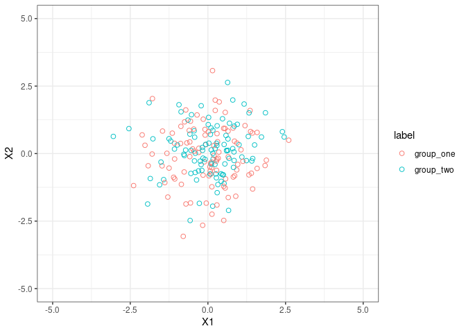
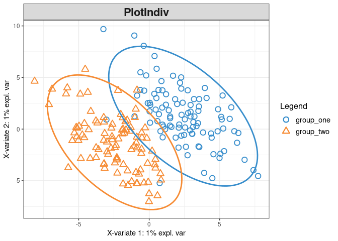
Let’s play with something high-dimensional
1
2
3
4
5
6
7
8
9
X<-subset(fig2_data,select = -c(10001))

X<-data.matrix(X)

ylabel<-fig2_data$label

plsda_results_fig2 <- plsda(X, ylabel, ncomp = 10, max.iter = 500)

plsda_results_fig2
1
2
3
4
5
6
7
8
9
10
11
12
13
14
15
16
17
18
19
20
21
22
23
24
25
26
27
##
## Call:
##  plsda(X = X, Y = ylabel, ncomp = 10, max.iter = 500)
##
##  PLS-DA (regression mode) with 10 PLS-DA components.
##  You entered data X of dimensions: 200 1001
##  You entered data Y with 2 classes.
##
##  No variable selection.
##
##  Main numerical outputs:
##  --------------------
##  loading vectors: see object$loadings
##  variates: see object$variates
##  variable names: see object$names
##
##  Functions to visualise samples:
##  --------------------
##  plotIndiv, plotArrow, cim
##
##  Functions to visualise variables:
##  --------------------
##  plotVar, plotLoadings, network, cim
##
##  Other functions:
##  --------------------
##  auc
1
plotIndiv(plsda_results_fig2, style ="ggplot2" , ind.names = FALSE,ellipse = TRUE,legend = TRUE)
1
2
3
4
5
6
7
8
9
10
# first_two_components<-cbind(plsda_results_fig2$variates$X[,1], plsda_results_fig2$variates$X[,2])
#
# first_two_components<-as.data.frame(first_two_components)
#
# first_two_components$label<-plsda_results_fig2$Y
#
# p1 <- ggplot(first_two_components, aes(x=V1, y =V2 ,color=label)) +
#   geom_point(shape = 1, size = 2)
# p1+theme_bw() + xlab("1st PLSDA Comp") + ylab("2nd PLSDA Comp")+ggtitle("PLSDA 1st and 2nd compnonets")
#