
Crash Course on Classification in Data Science
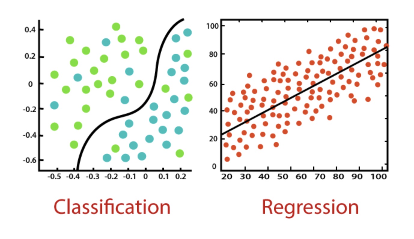
Two methods meetings ago, we learned all about linear regression. Probably the most common statistical technique, linear regression is most often used for predicting a continuous dependent variable (e.g., “What % grade do I expect someone to receive?) from some independent variables (“How many hours did they study?”). The following session we learned about linear mixed models, where we no longer modeled just overall trends (how does hours of studying vary with expected grade on average), but also how each individual subject behaved uniquely. And, as we saw, this gave us far more power and control to model and correctly predict more nuanced trends. And yet, the examples that were covered all involved predicting some continuous variable.
What if instead we want to predict whether someone or something belongs to certain class? For example, what if we want to predict if an email is spam or not, or if a bank loan recipient is likely to default or not? This is the purview of classification algorithms, and it is one of the most important techniques that data scientists (especially those in industry) use on an almost daily basis.
Table of Contents
- What if Classification?
- Our Data Set
- Logistic Regression
- Evaluating Model performance
- Alternative Models
- Conclusion
What is classification?
Classification models predict which of several classes an exemplar of data has. The most common form of classification is binary classification, where we predict a YES or a NO. For example, is this email spam or not? Is this image of a dog or not? etc. To do this, classification models learn the relationship between a set of independent variables (commonly called features) and the class identity of those data points, and learn to predict which class is most likely given those features. In this way, classification is really just an extension of linear regression, which also learns to predict something based on some independent variables.
Today, we will be learning about how to fo exactly this, to make predictions about the class membership of cases based on their features. We will start with binary classification, and then also see multiclass classification. We will see examples of logistic regression, support vector machine, and random forest algorithms, and at the end, provide additional resources if you want to learn about a whole set of other algorithms commonly used in data science.
Our Data Set
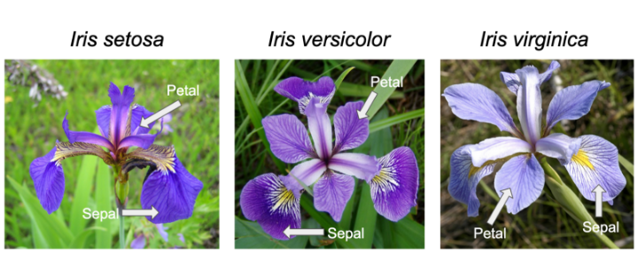
We will be using one of the simplest and most commonly used data sets in data science, the sklearn iris data set. This data set contains 150 examples (total) of flwoers that are either of the species setosa, versicolor, or virginica. Each of exemplar in our data set has a sepal length, sepal width, petal length, and petal width measurement provided. It is our job to determine whether we can classify each example into its flower type based on these features
1
2
3
4
5
6
7
8
9
import pandas as pd
import numpy as np
from sklearn.datasets import load_iris

iris = load_iris()
iris_df = pd.DataFrame(iris.data, columns=iris.feature_names)[['sepal length (cm)', 'petal length (cm)']]
iris_df['target'] = iris.target
iris_df = iris_df[iris_df.target != 0].replace({'target': {1: 0, 2: 1}}) #filtering out one of the three flower types
iris_df
| sepal length (cm) | petal length (cm) | target | |
|---|---|---|---|
| 50 | 7.0 | 4.7 | 0 |
| 51 | 6.4 | 4.5 | 0 |
| 52 | 6.9 | 4.9 | 0 |
| 53 | 5.5 | 4.0 | 0 |
| 54 | 6.5 | 4.6 | 0 |
| ... | ... | ... | ... |
| 145 | 6.7 | 5.2 | 1 |
| 146 | 6.3 | 5.0 | 1 |
| 147 | 6.5 | 5.2 | 1 |
| 148 | 6.2 | 5.4 | 1 |
| 149 | 5.9 | 5.1 | 1 |
100 rows × 3 columns
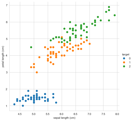
Let’s plot our data based on just two features, sepal length and petal length, colored by flower type.
1
2
3
4
5
6
7
import matplotlib.pyplot as plt
import seaborn as sns

sns.set_style("whitegrid")
sns.FacetGrid(iris_df, hue ="target", height = 6).map(plt.scatter,
        'sepal length (cm)','petal length (cm)').add_legend()
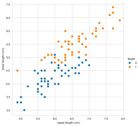
Nice! There seem to be meaningful differences between our species based on sepal length and petal length, although of course there are a few cases where there might be the chance for misclassification.
Thinking Like a Data Scientist
Before we proceed to running our classification model, we are going to do something that we don’t usually do as psychologists! When we fit a linear regression, we are building a model that can predict some y given some Xs. As psychologists, we do this so that we can learn which Xs are most predictive of y. That way, we can say “Aha, there is a main effect of studying on grades, such that more studying leads to significantly higher greades, but no effect of shoe size, so we don’t expect your shoe size not to influence which grades you get”. What we do NOT do is then use this model to make predictions about new incoming data. That is because we care much more about learning the relationships between predictors and outcome variables than we do developing a usable model that we then use.
Data scientists, especially those working for big companies, have a completely different set of priorities! Most data scientists do not care which independent variables predict some outcome. Instead, they want a usable model that they can actually use for new incoming data. Realizing this is a major step for scientists wanting to have careers in industry, as it impacts everything from how you talk about modeling during job interviews to what you’ll do in practice on the job.
Consider a spam filter classification model. A scientist building a spam engine would ask something like this: “What are the features of an email that make it spam-like?” Answering this question would allow them to say something about what it is that makes people perceive something as spam versus not. But a scientist isn’t actually trying to predit incoming emails from now on! A data scientist, on the other hand, would say “I don’t care what features make something spam-like. I do, though, want a model that will filter out spam emails for my customers.”
In practice, this means that scientists usually get to use all of their data. The more data, the more accurate a reflection the statistics will usually be as to the true relationship between predictors and outcome variables. For data scientists, though, we need to understand how well our model will perform for cases it has never seen, since that is the eventual use case. We therefore need to next split our data into a training and a test set.
1
2
3
4
5
from sklearn.model_selection import train_test_split

train_df, test_df = train_test_split(iris_df, test_size=0.2, random_state=1)
print(f"Training data set size: {train_df.shape}")
print(f"Test data set size: {test_df.shape}")
1
2
Training data set size: (80, 3)
Test data set size: (20, 3)
Now, when we fit our models below, we’ll train our models on the training data set only, and then evaluate on the testing data set.
Why Linear Regression Doesn’t Work
Before we get into logistic regression, lets remind ourselves what would happen if we ran a simple linear regression on our data set. As our simplest example, lets see if we can predict flower type using just sepal length. What happens if we fit a linear regression to this?
1
sns.regplot(x="sepal length (cm)", y="target", data=iris_df, ci=None);
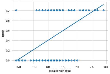
This sort of works, but the interpretation doesn’t make any sense! If sepal length, were say, 7, what class would we predict? Our regression predicts class = 0.8, but that doesn’t make sense. Or if sepal length were 15, our regression would predict class = 3, but that class doesn’t even exist. Is there a better way?
Logistic Regression
As you probably expect, of course there is! The insight is to model the y not as a continuous output between negative infinity and positive infinity, but as a probability bound between 0 and 1. We can do this using a sigmoid function, which is the linking function that a logistic regression uses. This function takes as input some y, say sepal length = 5 or sepal length = 10, and converts it into a single value between 0 and 1, which we can interpret as the probability that the examplar belongs to one class or another. Yep, that’s right! A logistic regression is a jsut a linear regression within a sigmoid function, which bounds y to be between 0 and 1, producing the classic s shape.
See this excellent series of StatQuest videos for more details on Logistic Regression!
1
sns.regplot(x="sepal length (cm)", y="target", data=iris_df, ci=None, logistic=True);
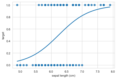
As we can see, our interpretation for sepal length = 15 makes way more sense now. Since the regression line asymptots onto the 1 class, it doesn’t matter how far we extend the x-axis, the model will make strong predictions that make sense.
Having seen it in the case of just a single predictor, lets run our logistic regression on our entire training set, so that we can evaluate the performance of the classifier.
1
2
3
4
5
6
7
8
from sklearn.linear_model import LogisticRegression

# getting the data from the train df into array format for sklearn
X_train = train_df.loc[:, train_df.columns != 'target'].values
y_train = train_df.target.values

# fit the logistic regression
lr = LogisticRegression(random_state=0).fit(X_train, y_train)
Sklearn makes this as simple as this! having fit our model, lets make predictions about our held out data set! We will compare this to the REAL labels to see how well we do.
1
2
3
4
5
6
7
# getting the data from the test df into array format for sklearn
X_test = test_df.loc[:, test_df.columns != 'target'].values
y_test = test_df.target.values

# make predictions using our logistic regression
y_pred = lr.predict(X_test)
y_pred
array([1, 1, 1, 1, 1, 0, 0, 1, 1, 1, 1, 0, 0, 1, 1, 0, 0, 0, 1, 0])
1
y_test
array([1, 1, 0, 1, 1, 0, 0, 1, 1, 1, 1, 0, 1, 1, 1, 0, 0, 0, 1, 0])
Evaluating Model Performance
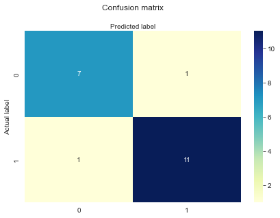
Ok, we’ve fit a logistic regression to some training data, and we’ve made some predictions about some held out data our model hasn’t seen before. What is the best way to measure model performance? Let’s start by looking at our overall confusion matrix, which shows us how we are classifying true and false cases.
1
2
3
4
from sklearn.metrics import confusion_matrix

cnf_matrix = confusion_matrix(y_test, y_pred)
cnf_matrix
array([[ 7, 1], [ 1, 11]])
1
2
3
4
5
6
7
8
9
10
11
12
13
14
# and lets make a nice plot
class_names=[0,1] # name  of classes
fig, ax = plt.subplots()
tick_marks = np.arange(len(class_names))
plt.xticks(tick_marks, class_names)
plt.yticks(tick_marks, class_names)

# create heatmap
sns.heatmap(pd.DataFrame(cnf_matrix), annot=True, cmap="YlGnBu" ,fmt='g')
ax.xaxis.set_label_position("top")
plt.tight_layout()
plt.title('Confusion matrix', y=1.1)
plt.ylabel('Actual label')
plt.xlabel('Predicted label')
Accuracy
Most people’s intuition would be to look at how often the model is correct. If we classify 95% of cases correctly, then we are doing great! Right? Can you think of a situation where this wouldn’t be the case?
It turns out that for most practical cases, accuracy is often not the best metric of model performance. Consider the case of determining whether a particular woman is color blind or not. Globally, about 0.5% of women have color blindness. We train a model, and find that our accuracy is 99.5%. Hooray! We clearly must be doing great at correctly classifying female color blindness. Or not. Since color blindness is so rare in women, we could actually have a model that simply says “Nope, no color blindness here!” to every single case it sees, without any learning at all. This model would still have an accuracy of 99.5%, even though it would be useless at predicting color blindness.
1
2
3
4
from sklearn.metrics import accuracy_score

acc = accuracy_score(y_test, y_pred)
print(f"Our accuracy is {acc*100:.1f}%!")
Our accuracy is 90.0%!
Recall
A better metric in this case might be something called recall. Imagine you are reaching your hand into a bowl of red and blue m&ms, and you only like the blue m&ms. You can only reach your hand in one time. How do you maximize how many m&ms you get? One way would be to take as a big of a handfull as possible. Sure, you’ll get a ton of red m&ms, but you’ll also get lots of yummy blue ones you can eat. We prioritize getting as many blues as possible, even if it means we accidentally grab some reds as well.
For our color blindness example, this prioritization (maximizing recall) is equivalent to trying to correctly classify as many of the true color blind cases as possible, even if it means we accidentally predict some people have color blindness that don’t (i.e., a false positive). This priority is great especially when the cost of missing a true positive is very high. Consider prostate cancer risk. We’d probably much rather give an unnecessary prostate screening to someone by incorrectly classifying them as high risk than not screening them by accidentally classifying them as low risk. To summarise, prioritizing recall means minimizing misses at the expense of false positives.
1
2
3
4
from sklearn.metrics import recall_score

recall = recall_score(y_test, y_pred)
print(f"Our recall is {recall*100:.1f}%!")
Our recall is 91.7%!
Precision
Another prioritization would be to instead say “I want my handful of m&ms to be as mostly blue as possible.” Or, for color blindness, “When I predict someone has color blindness, I want that prediction to be mostly correct.” This prioritization seeks to minimize false positives, as we want all of our positive predictions to be correct (hits).
Prioritizing precision is useful when the cost of a false positive is very high. For example, we likely don’t want to start unnecessary chemotherapy on someone by misclassifying their lung mri scan as indicating lung cancer.
If you’d like to learn more about precision and recall, see Mile’s excellent workshop on signal detection theory!
1
2
3
4
from sklearn.metrics import precision_score

precision = precision_score(y_test, y_pred)
print(f"Our precision is {precision*100:.1f}%!")
Our precision is 91.7%!
Alternative Metrics
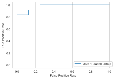
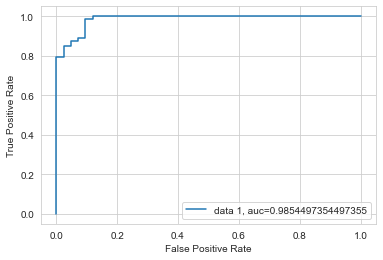
There are a variety of other metrics we might use, depending on our priorities. One common metric you’ll run into in data science is the area under the ROC curve. An ROC (“receiver operating characteristic”) curve shows the ratio of the true positives (hits) to false positives as you vary the threshold (what value of y should we say that the exemplar belongs to one class or other?).
1
2
3
4
5
6
7
8
9
10
from sklearn.metrics import roc_curve, roc_auc_score

y_pred_proba = lr.predict_proba(X_test)[::,1]
fpr, tpr, _ = roc_curve(y_test,  y_pred_proba)
auc = roc_auc_score(y_test, y_pred_proba)
plt.plot(fpr,tpr,label="data 1, auc="+str(auc))
plt.legend(loc=4)
plt.ylabel('True Positive Rate')
plt.xlabel('False Positive Rate')
plt.show()
Let’s consider what we are looking at.
In the case of threshold = 0, we will never classify a sample as case = 1. In that situation, our true positive rate is 0%, since we never catch any of the true cases. Our false positive rate is also 0, since we also never accidentally classify a false case positively.
In the case of threshold = 1, we classify every sample as case = 1. In this case, our true positive rate is 100% (we capture all cases), but so is out false positive rate, since we also falsly characterize all negative cases positively.
The interesting bit happens in the middle. Very briefly, a model performs randomly if the line falls along the center line. A model performs best when it generally resides in the top left corner, which is where the true positive rate is as high as possible and the false positive rate is as low as possible.
A Harder Data Set
Lets switch to a harder (and larger) data set so that we can better look at different models. We’ll use the breast cancer data set, which has 30 predictor variables!
1
2
3
4
5
6
7
# load the data set
from sklearn.datasets import load_breast_cancer

breast = load_breast_cancer()
breast_df = pd.DataFrame(breast.data, columns=breast.feature_names)
breast_df['target'] = breast.target
breast_df
| mean radius | mean texture | mean perimeter | mean area | mean smoothness | mean compactness | mean concavity | mean concave points | mean symmetry | mean fractal dimension | ... | worst texture | worst perimeter | worst area | worst smoothness | worst compactness | worst concavity | worst concave points | worst symmetry | worst fractal dimension | target | |
|---|---|---|---|---|---|---|---|---|---|---|---|---|---|---|---|---|---|---|---|---|---|
| 0 | 17.99 | 10.38 | 122.80 | 1001.0 | 0.11840 | 0.27760 | 0.30010 | 0.14710 | 0.2419 | 0.07871 | ... | 17.33 | 184.60 | 2019.0 | 0.16220 | 0.66560 | 0.7119 | 0.2654 | 0.4601 | 0.11890 | 0 |
| 1 | 20.57 | 17.77 | 132.90 | 1326.0 | 0.08474 | 0.07864 | 0.08690 | 0.07017 | 0.1812 | 0.05667 | ... | 23.41 | 158.80 | 1956.0 | 0.12380 | 0.18660 | 0.2416 | 0.1860 | 0.2750 | 0.08902 | 0 |
| 2 | 19.69 | 21.25 | 130.00 | 1203.0 | 0.10960 | 0.15990 | 0.19740 | 0.12790 | 0.2069 | 0.05999 | ... | 25.53 | 152.50 | 1709.0 | 0.14440 | 0.42450 | 0.4504 | 0.2430 | 0.3613 | 0.08758 | 0 |
| 3 | 11.42 | 20.38 | 77.58 | 386.1 | 0.14250 | 0.28390 | 0.24140 | 0.10520 | 0.2597 | 0.09744 | ... | 26.50 | 98.87 | 567.7 | 0.20980 | 0.86630 | 0.6869 | 0.2575 | 0.6638 | 0.17300 | 0 |
| 4 | 20.29 | 14.34 | 135.10 | 1297.0 | 0.10030 | 0.13280 | 0.19800 | 0.10430 | 0.1809 | 0.05883 | ... | 16.67 | 152.20 | 1575.0 | 0.13740 | 0.20500 | 0.4000 | 0.1625 | 0.2364 | 0.07678 | 0 |
| ... | ... | ... | ... | ... | ... | ... | ... | ... | ... | ... | ... | ... | ... | ... | ... | ... | ... | ... | ... | ... | ... |
| 564 | 21.56 | 22.39 | 142.00 | 1479.0 | 0.11100 | 0.11590 | 0.24390 | 0.13890 | 0.1726 | 0.05623 | ... | 26.40 | 166.10 | 2027.0 | 0.14100 | 0.21130 | 0.4107 | 0.2216 | 0.2060 | 0.07115 | 0 |
| 565 | 20.13 | 28.25 | 131.20 | 1261.0 | 0.09780 | 0.10340 | 0.14400 | 0.09791 | 0.1752 | 0.05533 | ... | 38.25 | 155.00 | 1731.0 | 0.11660 | 0.19220 | 0.3215 | 0.1628 | 0.2572 | 0.06637 | 0 |
| 566 | 16.60 | 28.08 | 108.30 | 858.1 | 0.08455 | 0.10230 | 0.09251 | 0.05302 | 0.1590 | 0.05648 | ... | 34.12 | 126.70 | 1124.0 | 0.11390 | 0.30940 | 0.3403 | 0.1418 | 0.2218 | 0.07820 | 0 |
| 567 | 20.60 | 29.33 | 140.10 | 1265.0 | 0.11780 | 0.27700 | 0.35140 | 0.15200 | 0.2397 | 0.07016 | ... | 39.42 | 184.60 | 1821.0 | 0.16500 | 0.86810 | 0.9387 | 0.2650 | 0.4087 | 0.12400 | 0 |
| 568 | 7.76 | 24.54 | 47.92 | 181.0 | 0.05263 | 0.04362 | 0.00000 | 0.00000 | 0.1587 | 0.05884 | ... | 30.37 | 59.16 | 268.6 | 0.08996 | 0.06444 | 0.0000 | 0.0000 | 0.2871 | 0.07039 | 1 |
569 rows × 31 columns
1
2
3
4
# train test split
train_df2, test_df2 = train_test_split(breast_df, test_size=0.2, random_state=1)
print(f"Training data set size: {train_df2.shape}")
print(f"Test data set size: {test_df2.shape}")
Training data set size: (455, 31) Test data set size: (114, 31)
1
2
3
4
5
6
# getting the data from the train df into array format for sklearn
X_train2 = train_df2.loc[:, train_df2.columns != 'target'].values
y_train2 = train_df2.target.values

# train a logistic regression
lr2 = LogisticRegression(random_state=0, max_iter=10000).fit(X_train2, y_train2)
1
2
3
4
5
6
#and get our test and predicted data sets
X_test2 = test_df2.loc[:, test_df2.columns != 'target'].values
y_test2 = test_df2.target.values

# make predictions using our logistic regression
y_pred2 = lr2.predict(X_test2)
1
2
3
4
5
6
7
8
9
10
11
12
13
14
15
16
17
18
19
20
21
22
23
#get our performance metrics
def get_binary_metrics(y_test, y_pred):
recall = recall_score(y_test, y_pred)
print(f"Our recall is {recall*100:.1f}%")
acc = accuracy_score(y_test, y_pred)
print(f"Our accuracy is {acc*100:.1f}%")
precision = precision_score(y_test, y_pred)
print(f"Our precision is {precision*100:.1f}%")
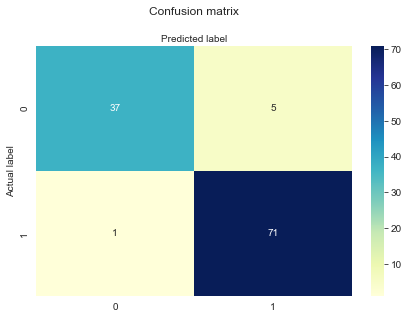
get_binary_metrics(y_test2, y_pred2)
cnf_matrix = confusion_matrix(y_test2, y_pred2)
fig, ax = plt.subplots()
tick_marks = np.arange(len(class_names))
plt.xticks(tick_marks, class_names)
plt.yticks(tick_marks, class_names)
sns.heatmap(pd.DataFrame(cnf_matrix), annot=True, cmap="YlGnBu" ,fmt='g')
ax.xaxis.set_label_position("top")
plt.tight_layout()
plt.title('Confusion matrix', y=1.1)
plt.ylabel('Actual label')
plt.xlabel('Predicted label')
Our recall is 98.6% Our accuracy is 94.7% Our precision is 93.4%
1
2
3
4
5
6
7
8
y_pred_proba2 = lr2.predict_proba(X_test2)[::,1]
fpr, tpr, _ = roc_curve(y_test2,  y_pred_proba2)
auc = roc_auc_score(y_test2, y_pred_proba2)
plt.plot(fpr,tpr,label="data 1, auc="+str(auc))
plt.legend(loc=4)
plt.ylabel('True Positive Rate')
plt.xlabel('False Positive Rate')
plt.show()
As you can see, logistic regression is a powerful tool even when we deal with many many predictor variables. Of course, this assumes that there is a clear relationship between the features and target variables, otherwise you won’t be able to predict anything.
Alternative Models
Support Vector Machine (SVM)
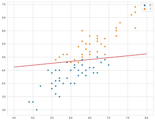
It really doesn’t make much sense to think of the versicolor class as a negative case and the virginica data set as a positive case, which is really what the binomial logistic regression was doing. Let’s look at the plot of iris data set again.
1
2
sns.FacetGrid(iris_df, hue ="target", height = 6).map(plt.scatter,
        'sepal length (cm)','petal length (cm)').add_legend()

What a support vector machine attempts to do is to draw a line between the two classes (at least in the case of binary classification). This “decision boundary” determine whether we fit a class to one category or the other. Lets try it! We’ll start by defining the data and fitting the svm model on our training data, then making predictions.
If you’d like to learn more about SVMs, see Daniela’s excellent workshop on SVMs!
1
2
3
4
5
6
7
8
9
10
11
12
13
14
15
16
from sklearn import svm

#define train data
train_df, test_df = train_test_split(iris_df[['sepal length (cm)','petal length (cm)', 'target']], test_size=0.2, random_state=1)
X_train = train_df.loc[:, train_df.columns != 'target'].values
y_train = train_df.target.values

#fit svm
svm_model = svm.SVC(kernel='linear', random_state = 31).fit(X_train, y_train)

# get predictions
X_test = test_df.loc[:, test_df.columns != 'target'].values
y_test = test_df.target.values
y_pred = svm_model.predict(X_test)

get_binary_metrics(y_test, y_pred)
Our recall is 91.7% Our accuracy is 90.0% Our precision is 91.7%
Next, we’ll visualize the actual decision boundary. This classifier will predict that any combination of x and y that fall above the line belong to that class.
1
2
3
4
5
6
7
8
9
10
11
12
13
14
plt.figure(figsize=(10, 8))

# Plotting our two-features-space
sns.scatterplot(x=X_train[:, 0],
                y=X_train[:, 1],
                hue=y_train);

# Constructing a hyperplane using a formula.
w = svm_model.coef_[0]           # w consists of 2 elements
b = svm_model.intercept_[0]      # b consists of 1 element
x_points = np.linspace(4.5, 8)    # generating x-points from -1 to 1
y_points = -(w[0] / w[1]) * x_points - b / w[1]  # getting corresponding y-points
# Plotting a red hyperplane
plt.plot(x_points, y_points, c='r');
The cool thing about svm is that it easily scales to multiple classes! We don’t have the time to cover this today unfortunately, but its ability to seemlessly draw multiple lines is one of the big strengths of svm. It is also very intuitive, as this is exactly the way you might classify data by hand if all you had was a pencil and paper.
1
2
3
4
5
6
7
# redownload iris, without removing one of the classes
iris_df = pd.DataFrame(iris.data, columns=iris.feature_names)
iris_df['target'] = iris.target

#plot three class version
sns.FacetGrid(iris_df, hue ="target", height = 6).map(plt.scatter,
        'sepal length (cm)','petal length (cm)').add_legend()
1
2
3
4
5
6
7
8
9
10
11
12
13
14
#define train data
train_df, test_df = train_test_split(iris_df[['sepal length (cm)','petal length (cm)', 'target']], test_size=0.2, random_state=1)
X_train = train_df.loc[:, train_df.columns != 'target'].values
y_train = train_df.target.values

#fit svm
svm_model = svm.SVC(kernel='linear', random_state = 31).fit(X_train, y_train)

#make predictions
X_test = test_df.loc[:, test_df.columns != 'target'].values
y_test = test_df.target.values
y_pred = svm_model.predict(X_test)

print(f"Accuracy: {accuracy_score(y_test, y_pred)}")
Accuracy: 0.9666666666666667
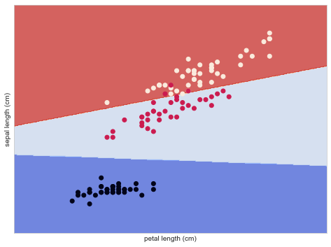
Below we visualize how this SVM would classify each case, depending on the particular combination of sepal length and petal length.
1
2
3
4
5
6
7
8
9
10
11
12
13
14
15
16
17
18
19
20
21
22
23
24
25
26
27
28
29
30
31
32
33
34
35
36
37
38
39
40
41
def make_meshgrid(x, y, h=0.02):
    """Create a mesh of points to plot in
    Args:
      x: data to base x-axis meshgrid on
      y: data to base y-axis meshgrid on
      h: stepsize for meshgrid, optional
    Returns:
      xx, yy : ndarray
    """
    x_min, x_max = x.min() - 1, x.max() + 1
    y_min, y_max = y.min() - 1, y.max() + 1
    xx, yy = np.meshgrid(np.arange(x_min, x_max, h),
                         np.arange(y_min, y_max, h))
    return xx, yy

def plot_contours(ax, clf, xx, yy, **params):
    """Plot the decision boundaries for a classifier.
    Args:
      ax: matplotlib axes object
      clf: a classifier
      xx: meshgrid ndarray
      yy: meshgrid ndarray
      params: dictionary of params to pass to contourf, optional
    Returns:
      None
    """
    Z = clf.predict(np.c_[xx.ravel(), yy.ravel()])
    Z = Z.reshape(xx.shape)
    out = ax.contourf(xx, yy, Z, **params)
    return out

fig, ax = plt.subplots(figsize=(8, 6))
X0, X1 = X_train[:, 0], X_train[:, 1]
xx, yy = make_meshgrid(X0, X1)
plot_contours(ax, svm_model, xx, yy, cmap=plt.cm.coolwarm, alpha=0.8)
plt.scatter(x = X_train[:, 0], y=X_train[:, 1], c=y_train)
ax.set_ylabel('sepal length (cm)')
ax.set_xlabel('petal length (cm)')
ax.set_xticks(())
ax.set_yticks(())
plt.show()
Random Forest
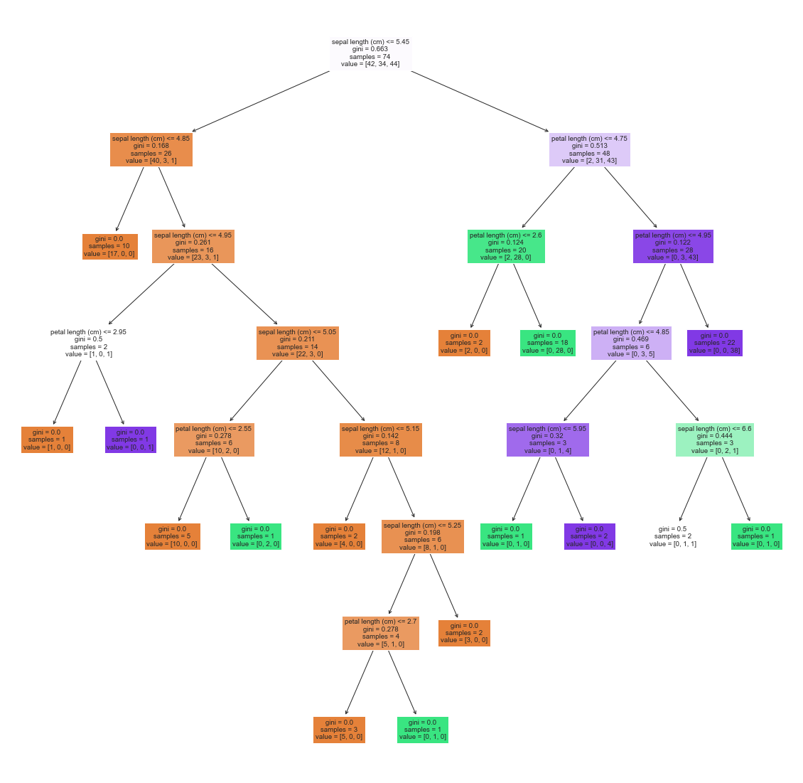
A third common classification algorithm you’ll regularly encounter in industry is a random forest classifier. Forest classifiers are a more advanced form of a very old school classification algorithm known as a decision tree. A decision tree looks something like this:
A random forest just makes many many of these decision trees, each only using a subset of the data. The various random forests predictions are then combined (each gets a “vote”) to make some final prediction. Lets try using a random forest classifier on our three class iris set.
1
2
3
4
5
6
from sklearn.ensemble import RandomForestClassifier

rf = RandomForestClassifier().fit(X_train, y_train)
y_pred_rf = rf.predict(X_test)

print(f"Accuracy: {accuracy_score(y_test, y_pred_rf)}")
Accuracy: 0.9666666666666667
This is all well and good, but what is actually going on? One way to visualize is to take a look at some of the decision trees that make up the random forest.
1
2
3
4
from sklearn.tree import plot_tree

plt.figure(figsize=(20,20))
_ = plot_tree(rf.estimators_[3], feature_names=iris_df.columns, filled=True)
Conclusion
So far we have covered logistic regression, support vector machines, and random forest classifiers. Of course, there are a million other algorithms, including naive bayes, neural networks, and other supervised learning classifiers, or a whole set of unsupervised learning classifiers like k-means classifiers. Becoming a data scientist means being familiar with many of these different classifiers, their strengths and limitations, and when you need to implement them, how to quickly learn to implement them.
And with that, we have finished a crash course on classification! We have learned to think like a data scientist, building usable models that need to be evaluated based on their performance on unseen data, which is not something psychologists usually do. We also realized we need to consider which particular metrics are most important for us. We might want a model that has a high recall, or a high precision, or some other value. The important thing to realize is that we can’t have it all, and we need to carefully consider our priorities. Finally, we saw that different models exist that can all be used for classification. Some are more interpretable than others, but others might have more power or flexibility. Which to use again depends on ones priorities.