
Introductions to dimensionality reduction
Finding structure
The whole goal of our experiments is to uncover some structure in behavior. In some cases we can make this easier for ourselves by simplifying the data we work with (for instance, analyzing one-dimensional variables the response time, or using simple-ish tasks that are well-designed). In some cases, we just don’t have that choice - usually in cases where we’re interested in neural, in addition to behavioral data. With EEG and fMRI, our data COME high dimensional. I know that in terms of space, these methods SEEM not super high dimensional (fMRI takes place in 3d, EEG takes place in like… 2.5d?), but in terms of data, they are VERY high dimensional. In our analysis, each feature is considered a dimension (in EEG, generally the number of channels; in fMRI, each voxel is a dimension), so these data are INCREDIBLY high dimensional. In neuroscience, this problem is only getting worse, with the number of neurons/channels we can simultaneously record from + the amount of time we can record from increasing exponentially every year. As Kevin pointed out last time, this is a big problem because our typical methods of analysis (like regression) scale really poorly. So how do we analyze our high dimensional data?
Well, the trick is, we don’t. It is too hard, so let’s make our problem easier! That’s the whole point of dimensionality reduction: finding a lower-dimensional problem that we can look at and analyze. So let’s dive in! We’ll cover two common methods today: Principal Component Analysis (PCA) and Independent Component Analysis (ICA). They have different uses and backgrounds, so let’s start with PCA!
PCA
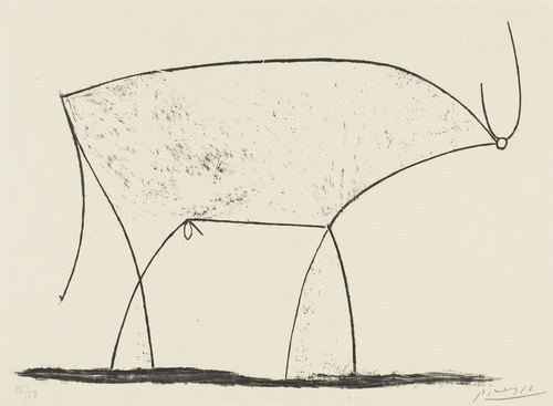
PCA is used all over neuroscience, and is more generally when you think your data are composed of a set of patterns over time. That may be a little abstract, so let’s use an example: Let’s say we have some data, like these:
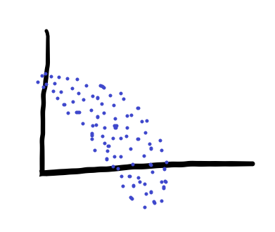
We could look at our data in our normal 2d axes, but that wouldn’t represent the variance in our data very well. So what we can do instead is rotate the axes to find the directions that describe variance in our data best. As a result, we’d end up with something like this:
Where the red and orange lines are the new, rotated axes that we are plotting our data on. Those axes are known as our Principal Components (hence the name). These axes are specifically special in how they describe variance.
Finding Principal Components
We find principal components using a special decomposition of the data called singular value decomposition. If our data are in a big matrix, \(X\), we can decompose this matrix into three easier to analyze matrices. The first, \(U\), contains the principal components of the columns of your data in its columns. The second, \(\Sigma\), contains the eigenvalues of your data (important for describing variance). The third, \(V\), contains the principal components of the rows of your data in its columns. Formally:
\[\begin{equation*} X = U \Sigma V^T \end{equation*}\]You don’t need to know how to calculate any of these - the computer will do it for you! It’s just useful to know what is being calculated so that you can troubleshoot if your principal components are not the shape that you expect.
Again, these principal components are ordered in a special way: by amount of variance explained in the data. The first principal component explains the most variance in the data, the second the second most, and so on. How do we get that?
Describing variance
We can get that by looking at the values in \(\Sigma\)! This matrix only has values on the diagonal. If the matrix has N diagonal components, the explained variance of component \(i\) is just \(\Sigma_{ii}/\sum_{j=1}^N \Sigma_{jj}\). One thing that people typically do with this information is use it to figure out how many principal components they need to describe their data well. If you data have 50 features, but the cumulative explained variance is 90% for just five principal components, then you’re in luck! Your data are really low dimensional! Usually you won’t get this lucky, but it can happen. Overall, cumulative explained variance is a good way to pick how many principal components you are going to use in your analysis.
Using Principal Components
Once you have these components, what do you do? Well, a good place to start is in visualizing your data. Usually, you can/do take the first 2-3 components of your data, plot them, and see if your data tend to cluster into little groups! You can look at what value your data have in each of these three components for each sample and begin to understand what’s going on. For instance, if you have different trial types, you could look at how your data look and color by trial type. If you have different samples at each point in time, you can look at how the data look across time, plotting trajectories in these principal components. This is usually a good place to start for analyses.
How does this work, in practice?
Let’s find out! In Python, there’s this really nice package called sklearn that lets us use the hard work that many other people have already done. Makes our life much easier!
1
from sklearn.decomposition import PCA
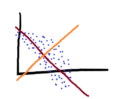
We also have a fun dataset to work with: this face dataset! The data in this dataset are 10 pictures each of 40 people each, and each picture is 64x64. The pictures look something like these:
Kinda low quality, but definitely faces! We then need to take a couple pre-processing steps before fitting PCA. These aren’t necessary, but they make the PCs we learn more generalizable (don’t have to explain any variance due to the mean of the data), and generally just more interesting in terms of our analysis.
1
2
3
4
5
6
7
faces,targets = datasets.fetch_olivetti_faces(return_X_y=True,shuffle=True)
n_samples, n_features = faces.shape

faces_centered = faces - faces.mean(axis=0)

# Local centering (focus on one sample, centering all features)
faces_centered -= faces_centered.mean(axis=1).reshape(n_samples, -1)
Now that we have our data, how do we fit PCA?
1
2
3
facePCA = PCA(
    n_components=6, svd_solver="randomized", whiten=True)
facePCA.fit(faces_centered)
This code will create a model that reduces the dimensionality of our data from n_features (here, 4096) to 6. Does this do a good job of describing our data? Well, let’s take a look!
Variance explained: 0.48443078994750977
It does not. However, it describes a surprisingly large amount! Over this 4096-dimensional space, just 6 dimensions account for roughly 50% of the variance (in our 400 sample dataset). Now remember, these first 6 components describe the patterns of features that describe the data. What do these first 6 patterns look like here?
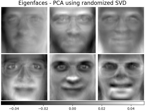
Terrifying, is the answer. These PCs are stored in
1
facePCA.components_[:n_components]
They do tell us SOMETHING about the data, however. It looks like many of these pictures had uneven lighting (were lit from the subjects’ left side or right side, given the first “eigenface”.) Many of them had glasses, and most of them were probably men. And they all have skeletons (eigenface #6). Which makes this a good place to note - the PCs you find will be highly specific to your data. If your data are not representative of the population you’re trying to get samples from, your PCs will DEFINITELY not be.
Another way to assess how much variance our PCs are accounting for is by looking at reconstructions. So for any given face, how do our reconstructions look?
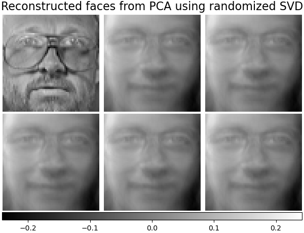 Not great! but again, that’s what we’d expect, given that our PCs account for roughly half of the variance in the data.
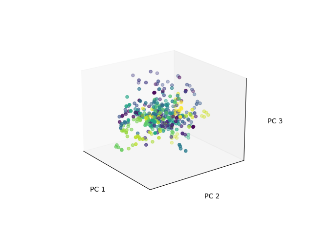
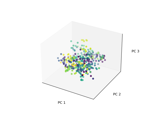
In a lot of neuroscience research, this is typically what people do! They run PCA on their data, look at their principal components (in their case, patterns of activity in neurons), and look at how the use of those components evolves over time. They visualize this by projecting onto these principal components, and look at the coordinates of the data in this new space.
That ends up looking something like this, where each color is a different subject’s set of pictures:
Not great! but again, that’s what we’d expect, given that our PCs account for roughly half of the variance in the data.
In a lot of neuroscience research, this is typically what people do! They run PCA on their data, look at their principal components (in their case, patterns of activity in neurons), and look at how the use of those components evolves over time. They visualize this by projecting onto these principal components, and look at the coordinates of the data in this new space.
That ends up looking something like this, where each color is a different subject’s set of pictures:
We get these projections with:
1
facesLD = facePCA.transform(faces_centered)
And we get reconstructions with:
1
reconstructions = facePCA.inverse_transform(facesLD)
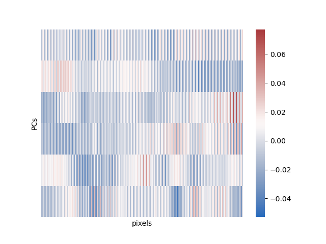
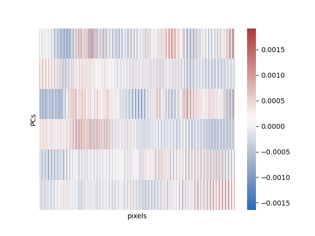
Finally, we can look at what all these PCs look like in pixel space in a heatmap:
And that’s most of what there is to PCA! Great for exploratory data analysis, can be used for later data analysis, just a good tool in general. One caveat: this method is great for preserving global structure in your data (the overall relationship between all the points), but does not preserve local structure (the exact neighborhood of any given point). The main extension of this method is probabilistic pca, which is harder to understand and requires more math and so I won’t go over it.
ICA
So if we already have this great method for describing variance in our data, why do we need anything else? Well, describing variance in our data is only one of many problems that we have. It can be really bad for situations where we have several signals mixed together, though. ICA is based in the following problem:
The cocktail party problem
Have you ever been at a party before, and you have 20 people talking at the same time, and you record from them simultaneously with 20 different microphones, and you want to extract each individual’s voice based on all the sounds mixed together in the air while you were recording? Me neither, but apparently that very specific situation happened to someone, because that was the basis for the cocktail party problem, or the source/signal separation problem. You have N different sources (here, voices at the party), and N different channels (microphones), and you want to demix and recover your sources. Also, they’re combined linearly, arestatistically independent, and you have some extra Gaussian noise on top of your sources. In formal math terms,
\[\begin{equation*} X = A Z + \epsilon \end{equation*}\]Where Z are our sources, X is our signal, A is our mixing matrix, and \(\epsilon\) is our noise. There are two ways you can think about solving this problem, and they end up being roughly the same! We can either
- minimize mutual information between independent components (fancy information theory way of saying making them independent), or
- maximize non-Gaussianity of each component.
That second one may sound a bit weird, but the it’s based in the assumptions of our model. If our sources were Gaussian, we wouldn’t be able to tell them apart from our noise! So we maximize how non-Gaussian a single source is, subtract that from the data, then do that again, until we end up with a purely Gaussian signal (just noise.)
What do we use ICA for?
ICA is really good (and primarily used in) artifact removal in EEG and fMRI, and is generally one of the pre-processing steps we take in either of those datasets. In EEG, the data are a mix of a bunch of biophysical data from the brain + biophysical data from the body - most saliently, eyeblinks, which cause HUGE artifacts. We typically try to use ICA to demix eyeblinks from the data we care about, then work on our denoised data. We do similar things for fMRI, but with things like fluctuations related to heartbeat, breathing, etc.
Practical notes
Like with PCA, there are a couple preprocessing steps which are really necessary before fitting our models. First, we need to center our data, like before. Next, we have to perform a second step: whitening of our data. This is a fancy way to say that we rotate and scale our data so that each of our different dimensions/channels has unit variance. This doesn’t change the information in our data at all, it just makes sure that each channel is weighted the same when we put it into ICA. Then, once we do all that, we’re ready to run ICA!
1
2
3
4
5
from sklearn.decomposition import FastICA

faceICA = FastICA(n_components=n_components, max_iter=400, whiten="arbitrary-variance", tol=15e-5
    )
faceLDICA = faceICA.fit_transform(faces_centered)
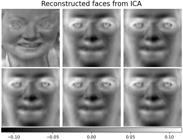
We can then plot all the same figures as above here, using the exact same code we used for PCA (sklearn is really nice that way):
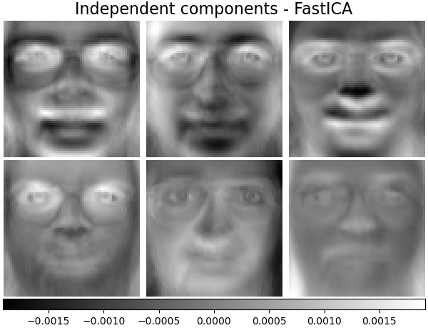
That’s mainly what there is to ICA! There are some extensions, particularly nonlinear ICA. ICA and all of its extensions have pretty much all been done by this one guy, Aapo Hyvärinen.
The one last thing I want to mention here is that the interpretation of ICA and PCA is fundamentally different. In PCA, the principal components are the patterns present in your data. As a result, we can look at how each of these patterns appears and disappears in your data across conditions, time, etc. The principal component IS your signal.
In contrast, in ICA the components we saw previously are not the signal. They are how your signal is mixed up to create the data that you have. The signals that you are looking for are contained in the lower-dimensional versions that you extract. The mixing matrix (what we have visualized above), is somewhat less important in our analysis than the low-dimensional representation.
What else is our there?
A lot! A whole lot! There are ways that we can specialize our analysis for cases like, if our data are non-negative. If our data are EXTRA high dimensional, we can use autoencoders, variational autoencoders, or other deep learning methods. There are random projections, which are a realllly cool and weird stats thing. There’s UMAP and T-SNE (both of which should ONLY BE USED FOR VISUALIZATION), and the list goes on. You could spend your whole life inventing and learning about dimensionality reduction methods (and I probably will!!!!)! But PCA and ICA are good places to start, and are probably the two easiest to understand. Thanks for stopping by!