
Understanding Gaussian processes
If you have ever tried to analyze time series data, you know that time series present all kinds of statistical challenges. Probably the most challenging aspect of time series data is that trends over time are almost never linear, which means that ordinary linear regression models are out of the window. But, even though we can pretty much count on the fact that time series are non-linear, we don’t usually have a good idea of what kind of non-linear they will end up being. That is, we don’t know if the line will be quadratic, cubic, exponential, periodic, or something else entirely. All we know is that the trend will be smooth, in the sense that points that are close together in time will have relatively similar values. So, what do we do?
Interestingly, papers in neuroscience usually end up doing something called a cluster-based analysis, which is a fancy way of saying that they fit a separate linear regression to each individual time point. This tends to get the job done, but it has three major issues. First, it tends to lose statistical power, since your estimates for a single time point cannot take into account earlier or later time points (even though we know that the value is likely somewhere in between the two). The second problem is that without carefully correcting your p-values, you tend to have an increased rate of false positives: you tend to find “significant” effects that don’t really exist. Finally, cluster-based analyses tend to be super slow, since you end up having to fit a ton of models individually.
The question is, can we do better? Enter the Gaussian process!
Gaussian Processes
Introduction
Gaussian processes are a super neat and flexible way to model all kinds of non-linear patterns in data over time and space. In contrast to cluster-based analyses, which treat different points in time independently, Gaussian processes model non-linear patterns by directly accounting for correlations between time points. Besides being cool, they also tend to help in terms of statistical power and false positives.
So, what is a Guassian process? Here’s what Wikipedia has to say:
In probability theory and statistics, a Gaussian process is a stochastic process (a collection of random variables indexed by time or space), such that every finite collection of those random variables has a multivariate normal distribution, i.e. every finite linear combination of them is normally distributed. The distribution of a Gaussian process is the joint distribution of all those (infinitely many) random variables, and as such, it is a distribution over functions with a continuous domain, e.g. time or space.
If you’re like me, at this point your eyes have probably glazed over, and you’re probably wondering why you’re here in the first place. But fear not! By the end of this workshop, you should have a pretty good understanding of what on earth a Gaussian process is, and how it can help you get those sweet, sweet, Nature papers.
Let’s back up
If you got anything at all out of the cryptic paragraph above, you probably realized that the phrase “Gaussian process” has the word “Gaussian” in it, which means that a Gaussian process has something to do with the Gaussian (or normal) distribution. So, let’s review:
The normal distribution is a distribution with two parameters: the mean \(\mu\) and the standard deviation \(\sigma\). You’ve probably encountered them in stats class in the context of p-values, where you had to reference a plot like this:
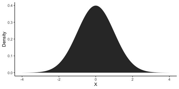
As you can see, the distribution is centered around \(\mu\) and has a width proportional to \(\sigma\). In this case, \(\mu = 0\) and \(\sigma = 1\), which is known as the standard normal distribution. If \(y_1\) is the subset of our data at the first time point, then, we can describe it using a normal distribution:
\[y_1 \sim \mathcal{N}(\mu, \sigma)\]Why is this is relevant for us? Well, because for the case of a single time point, the Gaussian process is just a normal distribution! So, if we only have to describe our data at one point in time, we can just model it using a normal distribution with any old linear regression package. Next time you want to sound cool and smart in front of your friends, you can tell them that you fit one-dimensional Guassian processes all the time!
One step at a time
Obviously, sometimes we need to be able to model distributions of data for more than one time point. So what do we do? If we used a normal distribution to model \(y_1\), then it makes sense for us to model \(y_2\) in exactly the same way:
\[\begin{align*} y_1 \sim \mathcal{N}(\mu_1, \sigma_1) \\ y_2 \sim \mathcal{N}(\mu_2, \sigma_2) \\ \end{align*}\]Now, this definitely works. But if you’ve been paying attention, it kind of misses some things. Namely, the approach above does the same thing as the cluster-based analyses we were dunking on in the intro: it treats all data at the first time point as independent to the data at the second time point, which is pretty bonkers! To see why this is the case, let’s write this model out as a two-dimensional normal distribution, where the first dimension is \(y_1\) and the second dimension is \(y_2\):
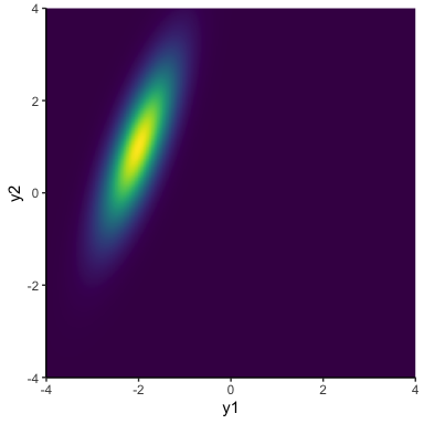
\[y_{1:2} \sim \mathcal{N}(\mathbf{\mu}, \mathbf{\Sigma})\]In this notation, \(\mathcal{N}\) is now a two-dimensional normal distribution. So, \(\mathbf{\mu} = \begin{bmatrix}\mu_1, & \mu_2\end{bmatrix}\) is now a vector of the two means, and \(\mathbf{\Sigma}\) is a 2 x 2 covariance matrix, which contains the (co)variance within and between the two dimensions \(\mathbf{\Sigma} = \begin{bmatrix} \sigma_1^2 & \sigma_1\sigma_2\rho \\ \sigma_1\sigma_2\rho & \sigma_2^2 \end{bmatrix}\). For now, it will simplify things if we factorize (split up) \(\mathbf{\Sigma} = \mathbf{\sigma \Omega \sigma}\), so that \(\mathbf{\sigma} = \begin{bmatrix}\sigma_1, & \sigma_2\end{bmatrix}\) contains the two standard deviations and \(\mathbf{\Omega}\) is a correlation matrix \(\mathbf{\Omega} = \begin{bmatrix}1 & \rho \\ \rho & 1\end{bmatrix}\), where \(\rho\) is just the correlation of the data between our two time points. If we assume that the data at each time point is independent (i.e., \(\rho = 0\)), then we can get distributions kind of like this:
The important thing to notice is that although there is some variance in \(y_1\) and some variance in \(y_2\), the distribution is perfectly vertical, meaning that learning the value of \(y\) at the first time point tells you nothing about \(y\) at the second time point. Another way to look at this is by sampling from this distribution and making a line plot:
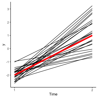
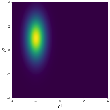
This plot shows how our model says \(y\) changes from the first to the second time point. The notable thing in this plot is that the lines that are below average for \(y_1\) are equally likely to be below or above average in \(y_2\). This is kind of weird, since typically we would expect things to be similar from time point to time point. Of course, the solution is just to relax the assumption that \(\rho = 0\). This gives us distributions that can lie along a diagonal:
In terms of changes over time, it means that \(y\) values that start out low are likely to stay low, and values that are high are likely to stay high:
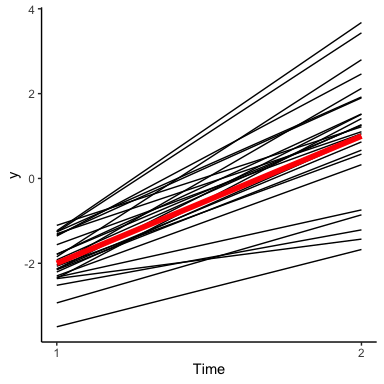
As we can see, this visually results in a lot less line crossing than we had earlier. As we add more and more points, this will help to give us time series curves that are smooth rather than bumpy.
Now that we’ve used a multivariate normal distribution to model data at two time points, the extension to three or more time points is seamless! To model $T$ time points, we just need to add some mean to \(\mathbf{\mu}\), add some standard deviations to \(\sigma\), and expand our correlation matrix accordingly:
\[\begin{align*} y_{1:2} &\sim \mathcal{N}(\mathbf{\mu}, \mathbf{\Sigma}) \\ \mathbf{\mu} &= \begin{bmatrix}\mu_1, & \mu_2, & \ldots & \mu_T\end{bmatrix} \\ \mathbf{\Sigma} &= \mathbf{\sigma \Omega \sigma} \\ \mathbf{\sigma} &= \begin{bmatrix}\sigma_1, & \sigma_2, & \ldots & \sigma_T\end{bmatrix} \\ \mathbf{\Omega} &= \begin{bmatrix} 1 & \rho_{1,2} & \ldots & \rho_{1,T} \\ \rho_{1,2} & 1 & \ldots & \rho_{2,T} \\ \vdots & \vdots & \ddots & \vdots \\ \rho_{1,T} & \rho_{2,T} & \ldots & 1 \end{bmatrix} \end{align*}\]Now we have one mean and one standard deviation per time point, as well as one correlation parameter between each pair of time points. Let’s look at an example with three time points (note that, as we add more and more dimensions, it will get more and more difficult to visualize the normal distribution itself):
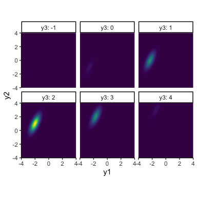
This tells us that there’s still a positive correlation between \(y_1\) and \(y_2\), but both of these have a positive correlation with \(y_3\). To make better sense of things, let’s revert back to the good old line plot:
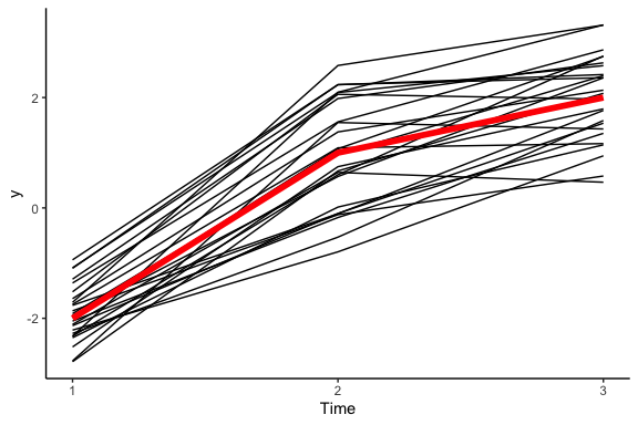
And there you have it! Hopefully it is becoming clear that we are using a clever trick to convert a multivariate normal distribution into a distribution over lines: each dimension of the distribution corresponds to a point on the line, and the means, standard deviations, and correlations define how the lines are shaped.
A kernel of truth
Although we can technically scale this up all the way to as many timepoints as we like, you might have noticed that the number of parameters we need to estimate is growing. It is perfectly fine for us to estimate a mean and standard deviation for each time point, since we are likely to have just as much data for each new time point that we add on. But every time we add another time point, the number of correlations we have to estimate grows pretty quickly. To be exact, for \(T\) time points, we have to estimate \(\frac{T(T-1)}{2}\) pairwise correlations, which quickly gets to become way too many correlations to ever have enough data to estimate.
The good news is that if we can make some reasonable assumptions, we don’t have to estimate the correlations all individually! The trick is to notice that not only are the distributions of \(y_{t_1}\) and \(y_{t_2}\) correlated, but also that the strength of this correlation should depend on the distance in time between \(t_1\) and \(t_2\).
For example, we might say that the correlation between \(y_{t_1}\) \(y_{t_2}\) follows an exponential decay:
\[\Omega(t_1, t_2) = \rho^{\lvert t_2 - t_1 \rvert}\]We can plot this function, known as an autocorrelation function, in a plot called a correlogram:
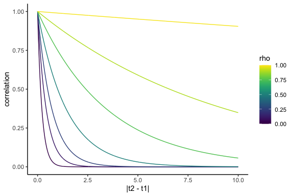
If we can assume this correlation structure, we can ensure that the correlation matrix we end up with is self-consistent over time. Additionally, now we only need to estimate a single corrlation parameter, rather than a whole bunch. For instance, for the correlation parameter \(\rho\), we have:
\[\begin{align*} \mathbf{\Omega} &= \begin{bmatrix} 1 & \Omega(1,2) & \ldots & \Omega(1,T) \\ \Omega(2,1) & 1 & \ldots & \Omega(2,T) \\ \vdots & \vdots & \ddots & \vdots \\ \Omega(T,1) & \Omega(T,2) & \ldots & 1 \end{bmatrix} \\ &= \begin{bmatrix} 1 & \rho & \ldots & \rho^{T-1} \\ \rho & 1 & \ldots & \rho^{T-2} \\ \vdots & \vdots & \ddots & \vdots \\ \rho^{T-1} & \rho^{T-2} & \ldots & 1 \end{bmatrix} \end{align*}\]And now it is exceptionally easy to extend our model to as many time
points as we need! For example, here are some samples from a five
hundred-dimensional multivariate normal distribution where the means are
all 0, the standard deviations are all 1, and \(\rho = .99\):
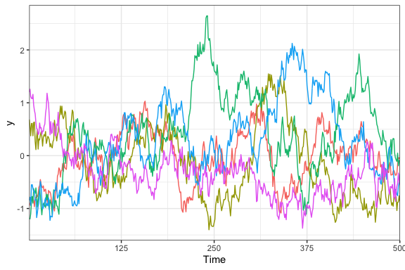
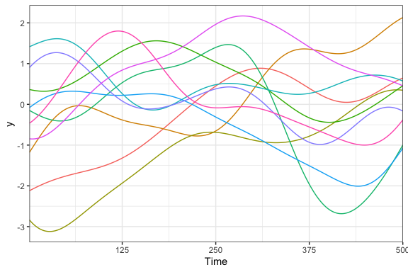
Now we’re getting somewhere! We very clearly have a bunch of squiggly lines that look like the squiggly lines you might see on a stock chart, temperature graph, or EEG plot. Best of all, we only need a single hyperparameter to describe the correlation from one time to another.
Decomposing our correlation matrix in this way (by generating it using a function of the timepoints dependent on a small number of hyperparameters) is called the kernel method, or the kernel trick. The exponentially-decaying kernel that we defined above is known as an autoregressive kernel, which constrains our Gaussian process to be equivalent to a simple autoregressive model (where each time point is linearly dependent on the previous one). This type of model is commonly used in all sorts of analyses, but the nice thing about Gaussian processes is that we can choose among a whole bunch of different kernels that might make sense for different purposes. For instance, the most commonly used kernel is probably the squared exponential kernel, also known confusingly as the radial basis function kernel or the Gaussian kernel:
\[k_{SE} = \sigma^2 \; e^{\frac{-(t_2 - t_1)^2}{2\ell^2}}\]This kernel lets us draw curves that are a bit more smooth, with the hyperparameters \(\sigma\) describing the residual standard deviation (now constrained to be the same across all time points) and \(\ell\) describing the time-scale of the correlations. Here’s a similar example to before, but this time using the squared exponential kernel:
As we can see, these lines are also nice and squiggly, but are smoother than the ones from before, which is why people tend to use this kernel a lot. To get an idea of all of the different kernels you can use, it’s worth taking a look at the Kernel Cookbook. In particular, it’s flexible enough that if one kernel isn’t enough, you can combine kernels additively or multiplicitavely to get a massive range of functional behavior.
To infinity and beyond
By now, hopefully it is relatively clear what a Gaussian process is: it is a special kind of multivariate normal distribution, where each dimension corresponds to a different point in space or time. By choosing a set of means and a covariance matrix, you choose a distribution of the kinds of lines that you can draw over time. Technically speaking, a Gaussian process is the generalization of this distribution where the number of dimensions is infinite, resulting in a distribution of perfectly wiggly lines. But in practice, we can never actually work with this generalization, since computers only have a finite amount of memory, and we never really require that kind of precision anyway. So, it is perfectly OK for us to focus on cases where the number of dimensions is finite (small, even).
While we haven’t talked at all about how to actually fit a Gaussian process to some data, getting over this conceptual hurdle really is a feat in itself: so go take a break, treat yourself, you deserve it! As a final parting gift, here is a Shiny app I made that lets you visualize the correlogram, covariance matrix, and time series from a Gaussian process with the squared exponential kernel:
Finally, if you’re craving more material on Gaussian processes, I can’t recommend these two blogs enough: