
ggplot2 workshop
Welcome! This is an intermediate-level workshop about the R package
ggplot2. It’s co-authored by
Allie and
Maria. We’ll cover custom aesthetics,
plotting model estimates, multi-layered plots, and advanced geoms
(spaghetti and rainbow plots!).
Table of Contents
- multi-layer plots (Allie)
- plotting model estimates (Maria)
- customizing plots (Maria)
- how to make a spaghetti plot (Allie)
- how to make a raincloud plot (Allie)
Tidy data
Like other packages in the tidyverse,
ggplot2 works best when your data are “tidy”: each column is a
variable, and each row is an observation. How exactly you define an
“observation” is going to be dependent on your question and desired
visualization, and it’s not uncommon to use a couple different versions
of your dataframe when playing around with visualizations.
Today we’ll be working with the dragons dataset that we’ve all come to know and love. This is a fictional dataset about dragons. Each dragon has one row. We have information about each dragon’s body length and cognitive test score. We also have some other information about each dragon: We know about the mountain range where it lives, color, diet, and whether or not it breathes fire.
Let’s load it in, along with some other packages.
1
2
3
4
5
6
7
8
9
10
11
12
13
14
#change some settings
options(scipen=999) #turn off scientific notation
options(contrasts = c("contr.sum","contr.poly")) #this tweaks the sum-of-squares settings to make sure the output of Anova(model) and summary(model) are consistent and appropriate when a model has interaction terms

# load in packages
library(dplyr) #for data wrangling
library(lme4) #fit the models
library(lmerTest) #gives p-values and more info
library(Rmisc) #summary stats
library(emmeans) #for extracting model estimates
library(ggplot2) #for plotting, duh!

# load the data
dragons <- read.csv("2020-10-21-dragon-data.csv")
Just as a reminder, let’s take a peak at our dataframe:
1
2
#take a peek at the header
head(dragons)
1
2
3
4
5
6
7
##    testScore bodyLength mountainRange color      diet breathesFire
## 1  0.0000000   175.5122      Bavarian  Blue Carnivore            1
## 2  0.7429138   190.6410      Bavarian  Blue Carnivore            1
## 3  2.5018247   169.7088      Bavarian  Blue Carnivore            1
## 4  3.3804301   188.8472      Bavarian  Blue Carnivore            1
## 5  4.5820954   174.2217      Bavarian  Blue Carnivore            0
## 6 12.4536350   183.0819      Bavarian  Blue Carnivore            1
1
2
#view the full dataset
View(dragons)
We have 2 continuous variables: testScore and bodyLength. The rest
of the variables are categorical. This gives us lots of options for
creatively visualizing relationships between different variables of
interest!
Multi-Layered Plots
I’m going to assume that you have some prior knowledge of R and ggplot2, but not much. Let’s start with a basic plot.
1
ggplot(data = dragons)
![]()
If we call ggplot() without specifying any variables, it just generates a blank square! This is actually the bottom layer of every plot. It’s a blank slate, waiting for us to layer data on top.
Let’s say our first research question is whether the color of the dragon is related to its intelligence. What happens when we specify those variables, but don’t add any geoms? We initialize a grid and axes, but don’t actually plot any data.
1
ggplot(data = dragons, aes(x = color, y = breathesFire))
Let’s add a basic bar plot layer. We can also color the bars using the fill argument.
1
2
ggplot(data = dragons, aes(x = color, y = testScore, fill = color)) +
  geom_bar(stat = "summary")
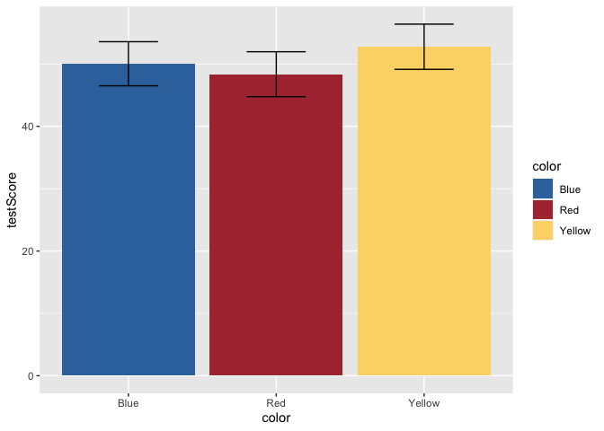
Yikes, we’ve generated a Stroop effect plot. Let’s specify a custom color palette and add that palette as a layer to our plot.
1
2
3
4
5
6
7
8
scale_fill_dragon <- function(...){
      library(scales)
      discrete_scale("fill","dragon",manual_pal(values = c("#3574AC","#AD343C","#FBD774")), ...)
}

ggplot(data = dragons, aes(x = color, y = testScore, fill = color)) +
  scale_fill_dragon() +
  geom_bar(stat = "summary")
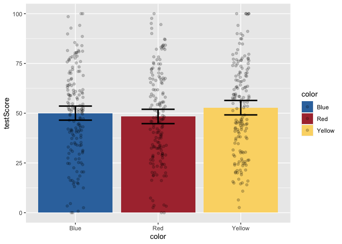
Great! That makes more sense. Now, let’s add some error bars for 95% confidence intervals. To do this, we’ll first calculate a small summary dataframe that will give us CIs. If you open this dataframe, you’ll see that you also get SE and SD measures.
1
2
3
4
5
6
dragons_sum <- summarySE(dragons, measurevar = "testScore", groupvars = c("color"))

ggplot(data = dragons, aes(x = color, y = testScore, fill = color)) +
  scale_fill_dragon() +
  geom_bar(stat = "summary") +
  geom_errorbar(data = dragons_sum, aes(ymin=testScore-ci, ymax=testScore+ci), width = 0.4)
But, this bar plot doesn’t tell us much about the distribution of the data, does it? Let’s add some points on top of the bars. We’ll also apply some horizontal jitter and adjust the opacity to make the points visible. We can also make the error bars thicker so they stand out.
1
2
3
4
5
ggplot(data = dragons, aes(x = color, y = testScore, fill = color)) +
  scale_fill_dragon() +
  geom_bar(stat = "summary") +
  geom_errorbar(data = dragons_sum, aes(ymin=testScore-ci, ymax=testScore+ci), width = 0.4, size = 1) +
  geom_jitter(width = 0.1, height = 0, alpha = 0.2)
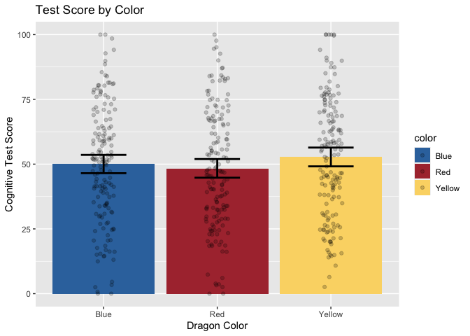
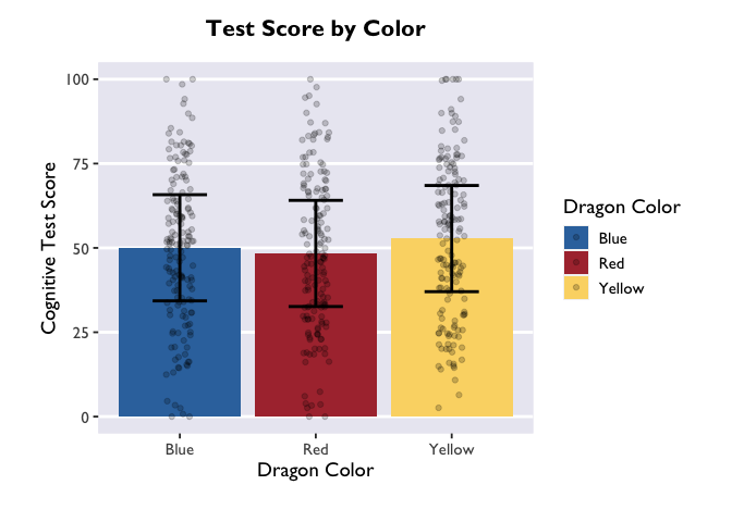
Now, let’s add layers for axis labels and a title.
1
2
3
4
5
6
7
8
ggplot(data = dragons, aes(x = color, y = testScore, fill = color)) +
  scale_fill_dragon() +
  geom_bar(stat = "summary") +
  geom_errorbar(data = dragons_sum, aes(ymin=testScore-ci, ymax=testScore+ci), width = 0.4, size = 1) +
  geom_jitter(width = 0.1, height = 0, alpha = 0.2) +
  xlab("Dragon Color") +
  ylab("Cognitive Test Score") +
  ggtitle("Test Score by Color")
Finally, just to make it pretty, let’s apply a custom theme that I use for my plots. For the sake of time, we won’t be covering the details of custom themes today, but you can find great tutorials online. These functions allow you to specify all your favorite aesthetic choices, and then easily apply those tweaks to future plots with just one line of code.
1
2
3
4
5
6
7
8
9
10
11
12
13
14
15
16
17
18
19
20
21
22
23
24
25
26
27
28
29
30
31
#if you want to access extra fonts, you can run the following lines of code.
#if you don't care during the tutorial, disable them. Loading the fonts (only the first time) can take several minutes if they are not already installed into R Studio.
library(extrafont)
#font_import() #first time only
#loadfonts(device= "win")

#here's my custom plotting theme. It's a function that specifies background colors, text font/size/position, and spacing.
theme_allie <- function(base_size = 14, base_family = "Gill Sans MT"){
  theme_gray(base_size = base_size, base_family = base_family) %+replace%
    theme(
      plot.margin=grid::unit(c(1,1,1,1), "cm"),
      plot.title = element_text(face = "bold", size = rel(1.15), hjust = 0.5, vjust = 5),
      panel.border = element_blank(),
      panel.background = element_rect(fill = "#EAEAF2", colour = "#EAEAF2"),
      strip.background = element_rect(fill = NA),
      panel.grid.major.y = element_line(size = 1, colour = "white"),
      panel.grid.minor.y = element_blank(),
      panel.grid.major.x = element_blank(),
      panel.grid.minor.x = element_blank()
      )
}

ggplot(data = dragons, aes(x = color, y = testScore, fill = color)) +
  scale_fill_dragon("Dragon Color") +
  geom_bar(stat = "summary") +
  geom_errorbar(data = dragons_sum, aes(ymin=testScore-ci, ymax=testScore+ci), width = 0.4, size = 1) +
  geom_jitter(width = 0.1, height = 0, alpha = 0.2) +
  xlab("Dragon Color") +
  ylab("Cognitive Test Score") +
  ggtitle("Test Score by Color") +
  theme_allie()

1
2
# if we wanted to save the plot in our current working directory, we could run the line below.
#ggsave("dragon_color.png", dpi = 300, width = 4, height = 4, units = "in")
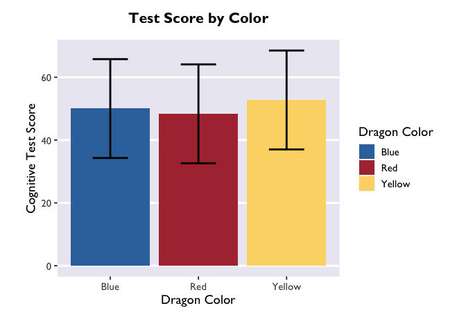
Plotting model estimates
Now that we know how to create beautiful multi-layered plots, let’s
learn how to plot the results of our mixed models! The emmeans package
is the star of the show here. Short for “estimated marginal means”, it
extracts the beta values, CIs, and more from a fitted lmer object.
Let’s start with the same question as we started with above – how is
color related to intelligence?
Linear mixed model with a categorical predictor
First we have to fit our lmer model. If you’re still new to emmeans,
it’s best to save the fitted model as an object so that you can play
around with different calls. At the end of the section I’ll show you the
fastest way to go from model -> plot.
1
2
model <- lmer(testScore ~ color + (1|mountainRange), data=dragons)
summary(model)
1
2
3
4
5
6
7
8
9
10
11
12
13
14
15
16
17
18
19
20
21
22
23
24
25
26
27
28
29
## Linear mixed model fit by REML. t-tests use Satterthwaite's method [
## lmerModLmerTest]
## Formula: testScore ~ color + (1 | mountainRange)
##    Data: dragons
##
## REML criterion at convergence: 3977.8
##
## Scaled residuals:
##     Min      1Q  Median      3Q     Max
## -3.4828 -0.6343 -0.0026  0.6986  3.0139
##
## Random effects:
##  Groups        Name        Variance Std.Dev.
##  mountainRange (Intercept) 349.1    18.68
##  Residual                  220.9    14.86
## Number of obs: 480, groups:  mountainRange, 8
##
## Fixed effects:
##             Estimate Std. Error       df t value Pr(>|t|)
## (Intercept)  50.3860     6.6407   7.0000   7.587 0.000128 ***
## color1       -0.3499     0.9594 470.0000  -0.365 0.715490
## color2       -2.0290     0.9594 470.0000  -2.115 0.034970 *
## ---
## Signif. codes:  0 '***' 0.001 '**' 0.01 '*' 0.05 '.' 0.1 ' ' 1
##
## Correlation of Fixed Effects:
##        (Intr) color1
## color1  0.000
## color2  0.000 -0.500
The results are not too exciting, but let’s make a dataframe with the marginal means anyway.
1
2
model_df <- emmeans(model, ~ color) %>% as.data.frame()
head(model_df)
1
2
3
4
##    color   emmean       SE       df lower.CL upper.CL
## 1   Blue 50.03612 6.709633 7.295226 34.29959 65.77265
## 2    Red 48.35704 6.709633 7.295226 32.62051 64.09356
## 3 Yellow 52.76494 6.709633 7.295226 37.02841 68.50147
Sweet! After converting the emGrid object to a dataframe, we now have estimates of test score as a function of color (the column “emmean”), as well as standard error, degrees of freedom, and upper/lower CIs. Let’s plot these using Allie’s custom theme:
1
2
3
4
5
6
7
8
ggplot(model_df, aes(x = color, y = emmean, fill = color)) +
  scale_fill_dragon("Dragon Color") +
  geom_col() +
  geom_errorbar(aes(ymin=lower.CL, ymax=upper.CL), width = 0.4, size = 1) +
  xlab("Dragon Color") +
  ylab("Cognitive Test Score") +
  ggtitle("Test Score by Color") +
  theme_allie()
The biggest difference between plotting in the emmeans-verse and in
the way Allie showed above is that your y variable will almost always be
“emmean” and you don’t have to compute confidence intervals yourself.
But if you want to add information about the raw data (like the jitter
above), then you’ll need to add a layer that takes data from the source
dataframe. Note that you only need to specify the dimension on which
your variable is different from the one in the main ggplot call – i.e.,
I only had to specify y=testScore in the geom_jitter() call.
1
2
3
4
5
6
7
8
9
ggplot(model_df, aes(x = color, y = emmean, fill = color)) +
  scale_fill_dragon("Dragon Color") +
  geom_col() +
  geom_errorbar(aes(ymin=lower.CL, ymax=upper.CL), width = 0.4, size = 1) +
  geom_jitter(data=dragons, aes(y=testScore), width = 0.1, height = 0, alpha = 0.2) +
  xlab("Dragon Color") +
  ylab("Cognitive Test Score") +
  ggtitle("Test Score by Color") +
  theme_allie()
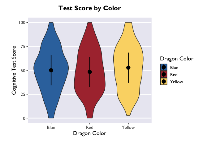
Another way to convey this information is with a violin plot, where the
estimate is plotted with geom_pointrange() and raw data as violin
widths:
1
2
3
4
5
6
7
8
ggplot(model_df, aes(x = color, y = emmean, fill = color)) +
  scale_fill_dragon("Dragon Color") +
  geom_violin(data=dragons, aes(y=testScore)) +
  geom_pointrange(aes(ymin=lower.CL, ymax=upper.CL), size = 0.85) +
  xlab("Dragon Color") +
  ylab("Cognitive Test Score") +
  ggtitle("Test Score by Color") +
  theme_allie()
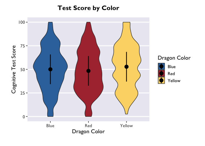
If you want to adjust the amount of smoothing in the violin (i.e., how
lumpy it is), you do that with the bw argument. Because bw sets the
standard deviation of the smoothing kernel for the distributions, the
magnitude of the bw value needed to achieve your desired results will
vary as a function of your data.
1
2
3
4
5
6
7
8
ggplot(model_df, aes(x = color, y = emmean, fill = color)) +
  scale_fill_dragon("Dragon Color") +
  geom_violin(data=dragons, aes(y=testScore), bw=4.5) +
  geom_pointrange(aes(ymin=lower.CL, ymax=upper.CL), size = 0.85) +
  xlab("Dragon Color") +
  ylab("Cognitive Test Score") +
  ggtitle("Test Score by Color") +
  theme_allie()
Linear mixed model with an interaction between categorical predictors
So far, so good. But what if we have a model with an interaction term? Let’s fit one and find out!
1
2
model2 <- lmer(testScore ~ color*diet + (1|mountainRange), data=dragons)
summary(model2)
1
2
3
4
5
6
7
8
9
10
11
12
13
14
15
16
17
18
19
20
21
22
23
24
25
26
27
28
29
30
31
32
33
34
35
36
37
38
39
40
41
## Linear mixed model fit by REML. t-tests use Satterthwaite's method [
## lmerModLmerTest]
## Formula: testScore ~ color * diet + (1 | mountainRange)
##    Data: dragons
##
## REML criterion at convergence: 3671.2
##
## Scaled residuals:
##     Min      1Q  Median      3Q     Max
## -3.0978 -0.5708 -0.0243  0.5190  4.6698
##
## Random effects:
##  Groups        Name        Variance Std.Dev.
##  mountainRange (Intercept)  82.64    9.091
##  Residual                  121.35   11.016
## Number of obs: 480, groups:  mountainRange, 8
##
## Fixed effects:
##               Estimate Std. Error        df t value             Pr(>|t|)
## (Intercept)   49.98257    3.25369   6.74874  15.362           0.00000168 ***
## color1        -0.46020    0.71397 463.78929  -0.645                0.520
## color2        -0.42132    0.71766 464.03951  -0.587                0.557
## diet1        -16.25262    0.92164 470.83945 -17.634 < 0.0000000000000002 ***
## diet2         17.15942    0.89337 470.92818  19.208 < 0.0000000000000002 ***
## color1:diet1  -0.19162    1.02754 463.93696  -0.186                0.852
## color2:diet1  -0.02199    1.00207 464.03628  -0.022                0.983
## color1:diet2  -0.70805    1.01244 464.39095  -0.699                0.485
## color2:diet2   0.42549    1.02280 464.32294   0.416                0.678
## ---
## Signif. codes:  0 '***' 0.001 '**' 0.01 '*' 0.05 '.' 0.1 ' ' 1
##
## Correlation of Fixed Effects:
##             (Intr) color1 color2 diet1  diet2  clr1:1 clr2:1 clr1:2
## color1      -0.001
## color2       0.000 -0.497
## diet1        0.005  0.027 -0.120
## diet2       -0.006  0.007  0.084 -0.663
## color1:dit1  0.004  0.041  0.035  0.012 -0.021
## color2:dit1 -0.015  0.036 -0.042 -0.051  0.018 -0.473
## color1:dit2  0.003 -0.021 -0.036  0.032 -0.042 -0.511  0.246
## color2:dit2  0.007 -0.029  0.008 -0.014  0.074  0.243 -0.482 -0.520
Whoa! Major effects of diet on test scores. Converting the model estimates to a dataframe is as simple as the following command:
1
2
3
4
5
6
7
model2_df <- emmeans(model2, ~ color | diet) %>% as.data.frame()

ggplot(model2_df, aes(x=diet, y=emmean, fill=color, color=color)) +
  scale_fill_dragon("Dragon Color") +
  geom_pointrange(aes(ymin=lower.CL, ymax=upper.CL), position=position_dodge(0.5)) +
  labs(x="Diet", y="Cognitive Test Score", color="Dragon color", fill="Dragon color") +
  theme_allie()
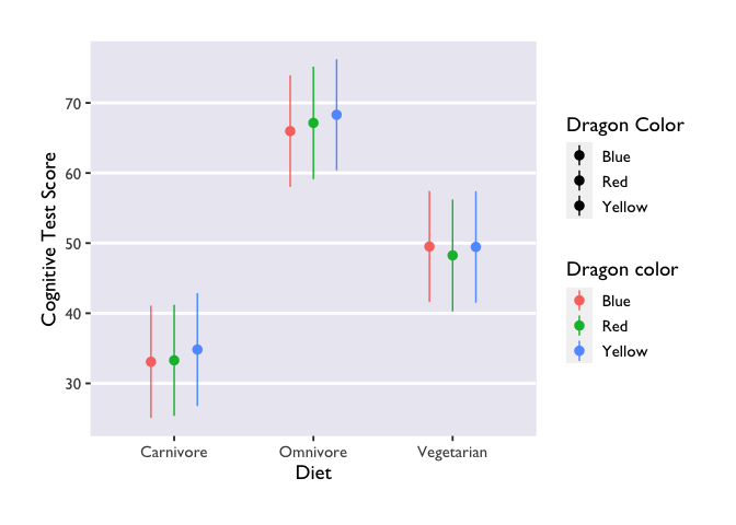
Three things to note: first, we indicate that we want to extract
marginal means for the main terms and interactions with the | operator
(did you know it’s called a ‘pipe’??? TIL!). The * operator will do
exactly the same thing, and it has the added benefit of being more
similar to lmer syntax.
Second, we made another Stroop plot! The colors of the geoms don’t match the color names, and we no longer have Allie’s beautiful colors. Unfortunately, this shows the limits of custom color palettes – since they’re hard-coded, they need to have enough colors to cover all the different combinations of your discrete variables. So if you wanted to make an interaction plot like this with the same colors as Allie’s, you’d need to make another palette that has 9 values instead of 3.
Third, we have two legends! One where the geoms are colored and another
where they are black. This highlights the difference between the color
and fill arguments. Color is used to set the color of line-based
objects, like the outline of a bar, violin, ribbon, etc. It’s also used
to set the color of points. Given that our geom is a combination of
point & line, it’s only going to be modifiable by color arguments.
Fill is used to “fill in” empty spaces, like the inside of a column,
ribbon, or violin. Since we don’t have any geoms that take the fill
argument in this plot, then it just shows up as black. Getting rid of
fill=color and scale_fill_dragon() will get rid of the superfluous
legend.
Generalized linear mixed model & continuous predictor variables
What if you want to plot the results of a generalized linear model? And what if you have a continuous predictor variable? Let’s investigate the relationship between color, bodyLength, and breathesFire to find out:
1
2
3
model3 <- glmer(breathesFire ~ color*bodyLength + (1|mountainRange), data=dragons, family=binomial(link = "logit"))
model3_df <- emmeans(model3, ~ color*bodyLength, type='response') %>% as.data.frame()
head(model3_df)
1
2
3
4
##    color bodyLength       prob         SE  df  asymp.LCL asymp.UCL
## 1   Blue   201.3165 0.90383086 0.02537801 Inf 0.84134741 0.9433625
## 2    Red   201.3165 0.52274341 0.05436631 Inf 0.41676412 0.6267137
## 3 Yellow   201.3165 0.06265896 0.02400686 Inf 0.02912871 0.1296326
1
2
# to confirm that we only get point estimates for each categorical predictor
length(model3_df)
1
## [1] 7
First thing to note: I added the argument type='response' to the
emmeans call. This ensures that our estimates are back-transformed to
the same scale as the original variable, instead of being on the
log-odds scale. If you’re using only categorical predictors, then this
is the only emmeans modification you have to worry about.
Second thing to note: the names of our variables in the dataframe are
different from those in the lmer() dataframe! Instead of emmeans, we
have prob; degrees of freedom are now infinite; and the CIs are now
values of the asymptote (asymp.LCL, asymp.UCL) instead of the fixed
upper and lower bounds (lower.CL, upper.CL). These differences all have
to do with the logit link, but all you need to know in terms of plotting
is that you’ll have to adjust your variable names accordingly.
Finally, because we have a continuous predictor, there is a third thing
to note: we only got point estimates for the effect of color at the mean
value of bodyLength. But that’s not how we think about or want to plot
the effect of a continuous predictor! Thus, we need to specify the range
of bodyLength values that we want emmeans to return estimates from.
There are a number of ways to do this, and the “best” way is contingent
on your research question and/or desired visualization. And fortunately,
this method remains the same regardless of your model type (i.e., if
it’s lmer() or glmer()).
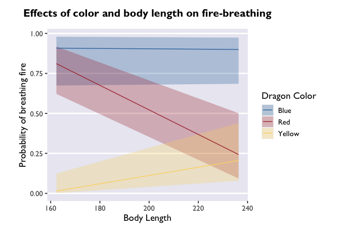
One approach is to get estimates from the lowest and highest values (i.e., the range) of bodyLength. Here’s how you do that:
1
2
3
# extracting estimates at the extremes and mean values of bodyLength
model3_df <- emmeans(model3, ~ color*bodyLength, type='response', cov.reduce=range) %>% as.data.frame()
head(model3_df)
1
2
3
4
5
6
7
##    color bodyLength       prob         SE  df   asymp.LCL asymp.UCL
## 1   Blue   162.3266 0.90822227 0.06654721 Inf 0.674224946 0.9793036
## 2    Red   162.3266 0.81107636 0.07497809 Inf 0.621985544 0.9180434
## 3 Yellow   162.3266 0.01460516 0.01656817 Inf 0.001549897 0.1239744
## 4   Blue   236.3625 0.89971296 0.06519867 Inf 0.685204776 0.9736679
## 5    Red   236.3625 0.24283279 0.10726832 Inf 0.092736596 0.5015619
## 6 Yellow   236.3625 0.20571388 0.09259853 Inf 0.078587479 0.4402323
1
2
3
4
5
6
7
8
# plot those estimates
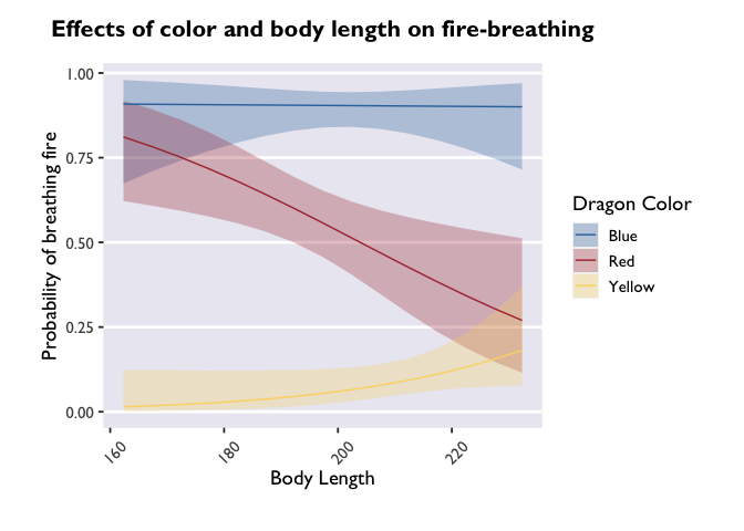
ggplot(model3_df, aes(x=bodyLength, y=prob,fill=color)) +
geom_ribbon(aes(ymin=asymp.LCL, ymax=asymp.UCL), alpha=0.3) +
geom_line(aes(color=color)) +
scale_fill_dragon("Dragon Color") +
scale_color_manual(values=c("#3574AC","#AD343C","#FBD774")) +
labs(y='Probability of breathing fire', x='Body Length', color='Dragon Color', title='Effects of color and body length on fire-breathing') +
theme_allie()
But if you want a more detailed representation of the effect, you can
write a quick function that tells emmeans() to extract estimates along
the whole range of bodyLength values in X-sized increments:
1
2
3
4
5
6
7
8
9
10
11
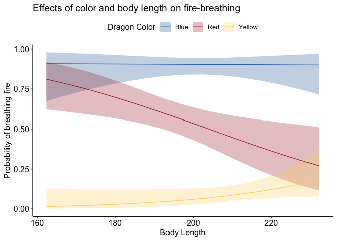
# write a function to extract values of bodyLength in "precision"-sized increments
bodyLength_range <- function(bodyLength, precision=5) {
return(seq(min(dragons[,bodyLength], na.rm=TRUE),
max(dragons[,bodyLength], na.rm=TRUE),
precision))
}
# tell emmeans to extract estimates at values of bodyLength specified by the function bodyLength_range
model3_df <- emmeans(model3, ~ color*bodyLength, type='response', at=list(bodyLength=bodyLength_range('bodyLength'))) %>% as.data.frame()
head(model3_df)
1
2
3
4
5
6
7
##    color bodyLength       prob         SE  df   asymp.LCL asymp.UCL
## 1   Blue   162.3266 0.90822227 0.06654721 Inf 0.674224946 0.9793036
## 2    Red   162.3266 0.81107636 0.07497809 Inf 0.621985544 0.9180434
## 3 Yellow   162.3266 0.01460516 0.01656817 Inf 0.001549897 0.1239744
## 4   Blue   167.3266 0.90766865 0.05958259 Inf 0.709312449 0.9753722
## 5    Red   167.3266 0.78275913 0.07300889 Inf 0.608334845 0.8931490
## 6 Yellow   167.3266 0.01766287 0.01818495 Inf 0.002299758 0.1230034
1
2
3
4
5
6
7
8
# let's see the difference this makes in the plot!
ggplot(model3_df, aes(x=bodyLength, y=prob,fill=color)) +
  geom_ribbon(aes(ymin=asymp.LCL, ymax=asymp.UCL), alpha=0.3) +
  geom_line(aes(color=color)) +
  scale_fill_dragon("Dragon Color") +
  scale_color_manual(values=c("#3574AC","#AD343C","#FBD774")) +
  labs(y='Probability of breathing fire', x='Body Length', color='Dragon Color',title='Effects of color and body length on fire-breathing') +
  theme_allie()
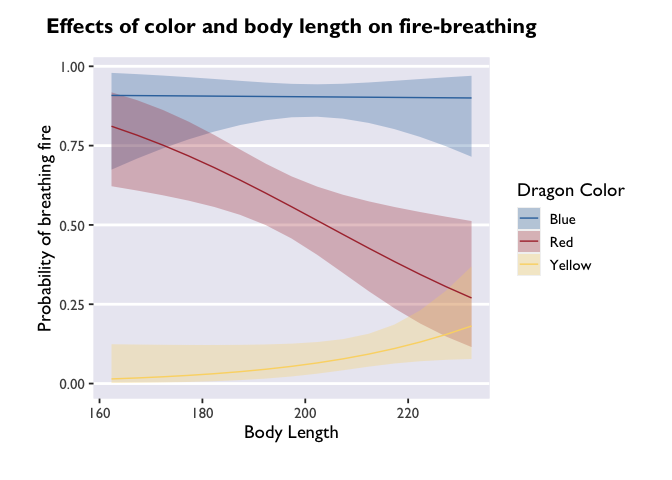
Cool! The trends are still there, but now we have a more detailed depiction of how the probability of fire-breathing changes as a function of body length.
emmeans
is an immensely useful companion package for lme4 and lmerTest. The
vignettes on the page linked here are very helpful, and can be quite
illuminating about all the things you can do with fitted mixed models. I
highly recommend playing around with it to build up your knowledge about
mixed models!
And once you get familiar with emmeans & lmer, you can take the
fast-track to plotting model estimates:
1
2
3
4
5
6
7
8
9
10
glmer(breathesFire ~ color*bodyLength + (1|mountainRange), data=dragons, family=binomial(link = "logit")) %>%
  emmeans(., ~ color*bodyLength, type='response', at=list(bodyLength=bodyLength_range('bodyLength'))) %>%
  as.data.frame() %>%
  ggplot(., aes(x=bodyLength, y=prob,fill=color)) +
  geom_ribbon(aes(ymin=asymp.LCL, ymax=asymp.UCL), alpha=0.3) +
  geom_line(aes(color=color)) +
  scale_fill_dragon("Dragon Color") +
  scale_color_manual(values=c("#3574AC","#AD343C","#FBD774")) +
  labs(y='Probability of breathing fire', x='Body Length', color='Dragon Color',title='Effects of color and body length on fire-breathing') +
  theme_allie()

Customizing your plots
Perhaps my favorite thing about ggplot2 is how much flexibility and
control you have over your plots. Since I don’t know what you don’t
know, this section is going to be a compilation of aesthetic tweaks that
I’ve had to make in my very short research career. If there’s a specific
thing you want to know how to do, let me know and I’ll update the post!
Creating a custom color palette
Like all things programming, there are multiple ways to do this.
Allie demonstrated one method above that I’ll reproduce here:
1
2
3
4
scale_fill_dragon <- function(...){
      library(scales)
      discrete_scale("fill","dragon",manual_pal(values = c("#3574AC","#AD343C","#FBD774")), ...)
}
I had no idea you could make a custom palette like this! I’ve always
used the paletti package to do
this. All you do is specify a vector of HEX codes and pass it to some
nested arguments from the packge:
1
2
3
4
5
6
# load the package
library(paletti)
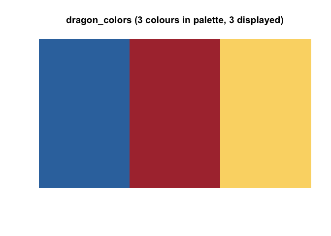
# specify the colors
dragon_colors <- c("#3574AC","#AD343C","#FBD774")
# preview the palette
viz_palette(dragon_colors)
1
2
3
# create the palette
dragon_fill <- get_scale_fill(get_pal(dragon_colors))
dragon_color <- get_scale_color(get_pal(dragon_colors))
Custom palettes are great for a lot of reasons, but they can take a lot of work to hone. Sourcing colors for palettes is one of my favoite forms of procrastination, but if you just want to get things done, here is an excellent resource canvassing color palettes available to R users. I don’t know if it’s completely comprehensive, but it’s pretty darn close. It also has some great resources for generating HEX codes if you are interested in making a plotting theme but have no idea where to start.
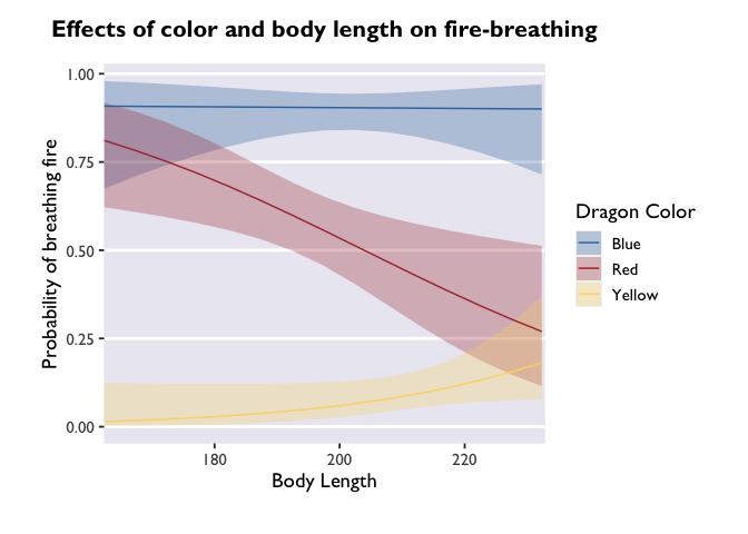
Modifying axes
Let’s take a look at one of our glmer() plots. You’ll notice that I’m
saving this ggplot call to the variable p. I’m doing this to take
advantage of the syntax and demonstrate that you can modify plots even
after they’ve been saved. That’s one of the many beautiful things about
ggplots: you can just keep adding layers until you get the plot of your
dreams. [am i the only one who dreams about beautiful plots?]
1
2
3
4
5
6
7
8
9
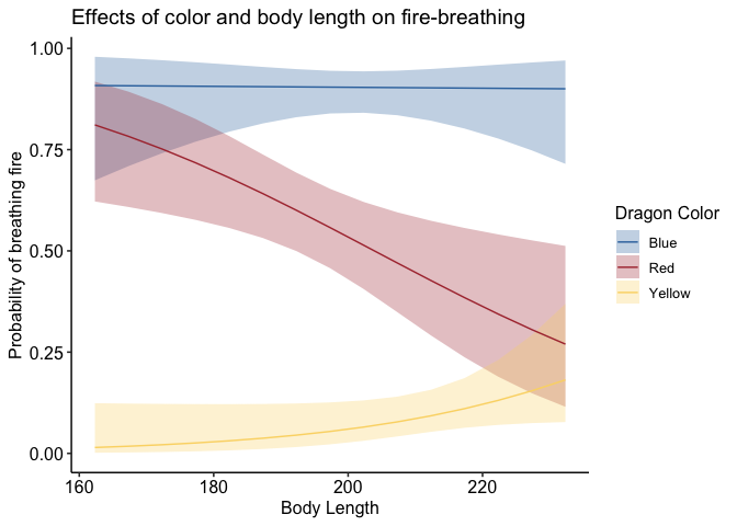
p <- ggplot(model3_df, aes(x=bodyLength, y=prob,fill=color)) +
geom_ribbon(aes(ymin=asymp.LCL, ymax=asymp.UCL), alpha=0.3) +
geom_line(aes(color=color)) +
scale_fill_dragon("Dragon Color") +
scale_color_manual(values=c("#3574AC","#AD343C","#FBD774")) +
labs(y='Probability of breathing fire', x='Body Length', color='Dragon Color', title='Effects of color and body length on fire-breathing') +
theme_allie()
p

It’s beautiful, right? But what if you don’t want that extra gray space
around the edges of the x-axis? That’s where the expand argument of
scale_x_continuous comes in. This allows you to set the “range
expansion constants” the ggplot uses to add padding around the axes. For
continuous variables, like we have, the default is to expand the scale
by 5% on each side. For discrete variables (scale_x_discrete), the
default is 0.6 units.
Based on my tinkering, it seems like small increases in the first or
third value of expand will result in big changes at the leftmost and
rightmost points on the x-axis, respectively. Small increases to the
second or fourth values will results in small changes at the leftmost
and rightmost points on the x-axis. There is definitely a better
explanation for this (probably having to do with y-values), but I’ll
leave that for you to discover! For now, I’ll set all the values except
the last to 0 so you can get an idea of how this shifts the plotting
space:
1
2
3
4
5
6
7
8
ggplot(model3_df, aes(x=bodyLength, y=prob,fill=color)) +
  geom_ribbon(aes(ymin=asymp.LCL, ymax=asymp.UCL), alpha=0.3) +
  geom_line(aes(color=color)) +
  dragon_fill() +
  dragon_color() +
  scale_x_continuous(expand = c(0, 0, 0, 0.5)) +
  labs(y='Probability of breathing fire', x='Body Length', color='Dragon Color', fill='Dragon Color', title='Effects of color and body length on fire-breathing') +
  theme_allie()
If you wanted to change the breaks on your x-axis, change the labels of
the breaks, or adjust the limits, you can do that all with different
arguments inside the scale_x_continuous call.
Have you ever wondered how people get their x-axis labels on a slant? Here’s how:
1
p + theme(axis.text.x = element_text(angle = 45, vjust = 0, hjust=0))
angle adjusts the angle (setting it to 90 would make the labels
perpendicular to the plot), and vjust and hjust move the labels
along the vertical and horizontal dimensions.
Themes
One of the most powerful ways to customize your plots beyond the ggplot
defaults is to play with different themes. Allie built her own (which is
next-level), but there are many really nice and elegant themes that can
really take your plot to the next level. Some are built into ggplot
(like theme_minimal() or theme_classic), but others come from
devoted packages. One of my favorites is theme_pubr(). Let’s see how
it changes our glmer() plot:
1
2
library(ggpubr)
p + theme_pubr()
If you don’t like the legend on top, you can adjust that very simply:
1
p + theme_pubr(legend='right')
To adjust the position of your legend, or really anything about the
plotting space that doesn’t have to do with geoms (so things like axes,
backgrounds, text size, etc.), you’ll pass a command to the theme()
function of ggplot. Something I can’t recommend highly enough is taking
time to learn about and play around with all the different arguments
that can be passed to theme(). That’s where the vast majority of
customization comes in!
An important note: the layering of arguments within a ggplot object does
indeed matter. Geoms get stacked on top of each other based on the order
they’re listed. So if you want to overlay a jitter on top of a bar plot,
you need to make sure geom_jitter comes after geom_col. Likewise
with theme arguments that aren’t included in the base ggplot2
package. If you specify, for example, theme_pubr(legend='right'), but
then add legend.position='center' in your theme() call that comes
after the theme_pubr() call, then your legend is going to be placed in
the location of the most recent call; in this example, it would be
centered. I’ve run into this with things like font styles before, and
endured a fair share of head-bashing before realizing what I was doing.
Please learn from my mistakes!
Writing a plotting function
Let’s say you have a plot style that you want to retain for a
number of different plots. Instead of copying and pasting the same lines
of code, you can simply write a function that defines all your plot
parameters and use that to generate a bunch of plots. Let’s step out of
the emmeans()-verse for a minute and look at how testScore and
bodyLength are related to color:
1
2
3
4
5
6
7
8
9
10
11
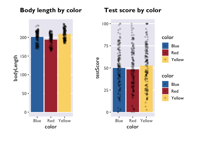
dragon_plot <- function(yvar, title) {
ggplot(dragons, aes_(x=~color, y=yvar, fill=~color)) +
geom_bar(stat = "summary") +
geom_jitter(width = 0.1, height = 0, alpha = 0.2) +
ggtitle(title) +
scale_fill_dragon() +
theme_allie()
}
plot_bodyLength <- dragon_plot(~bodyLength, 'Body length by color')
plot_testScore <- dragon_plot(~testScore, 'Test score by color')
The important thing to note here is that you use aes_ instead of the
regular aes call, that the variables that you want to stay constant
across plots are preceded by a ~ when you define the function, and
that the variables you want to sub in are preceded by a ~ when you
call the function.
During the workshop, Kevin noted that you can use aes_string() instead
of aes_ and then substitute all the ~s for character strings.
Patchwork!
Let’s make these two plots into one figure using the awesome package
patchwork. This is another
package I can’t recommend enough. It uses the syntax of ggplot2 to
allow you to combine multiple plots into one figure. I won’t go into
details here, but you should definitely check out the (beautiful and
easy to use) website to learn more.
1
2
library(patchwork)
plot_bodyLength + plot_testScore + plot_layout(guides='collect')
1
2
# and if we wanted to export this figure as one single image, we would run:
#ggsave('filepath', dpi='retina')
Spaghetti Plots
Next, let’s learn how to create spaghetti plots that connect the
dots for within-subjects measures. Unfortunately, we only measured our
dragons once (after all, they are hard to catch). So we’ll quickly load
one of Allie’s real datasets to look at some repeated measures.
1
2
3
4
5
6
7
8
9
10
PE_recon <- read.csv("PE_recon.csv", fileEncoding="UTF-8-BOM")
PE_recon_sum <- summarySE(PE_recon, measurevar = "Errors_mean", groupvars = c("Group", "Type"))

ggplot(PE_recon, aes(x = Type, y = Errors_mean)) +
  theme_allie() +
  geom_point(aes(group=ID), color="#2b2e33", alpha = 0.25, size = 1.5) +
  geom_line(aes(group=ID), color="#2b2e33", alpha = 0.25) +
  xlab("Reactivation Type") +
  ylab("Average False Memories per Video") +
  ggtitle("False Memories")
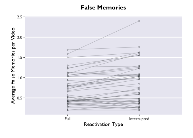
The “group=ID” argument is doing the magic here. Try removing it
from the geom_point and geom_line layers, and see what happens. Not
pretty.
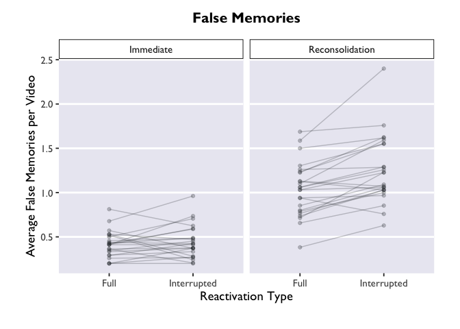
But wait! We actually have another grouping variable in
this dataset. This was a 2x2 design, where we had a between-subjects
contrast and a within-subjects contrast. Let’s create separate panels
for our between-subjects variable, Group.
1
2
3
4
5
6
7
8
ggplot(PE_recon, aes(x = Type, y = Errors_mean)) +
  theme_allie() +
  geom_point(aes(group=ID), color="#2b2e33", alpha = 0.25, size = 1.5) +
  geom_line(aes(group=ID), color="#2b2e33", alpha = 0.25) +
  xlab("Reactivation Type") +
  ylab("Average False Memories per Video") +
  ggtitle("False Memories") +
  facet_wrap(.~Group)
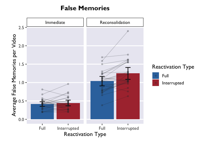
Much more informative, but this plot is still very bland. Let’s add
some bars to display the average for each condition, and give those bars
some color. We can add errorbars while we’re at it.
Note that we
are putting the geoms for the new bars BEFORE the geoms for the points
and lines. What happens if we move these geoms around? Try changing the
order to see how it affects the plot.
1
2
3
4
5
6
7
8
9
10
11
12
ggplot(PE_recon, aes(x = Type, y = Errors_mean, fill = Type)) +
  theme_allie() +
  scale_fill_dragon(name = "Reactivation Type") +
  scale_x_discrete(name = "Reactivation Type") +
  geom_bar(stat = "summary", fun.y = "mean", na.action=na.omit) +
  geom_errorbar(data = PE_recon_sum, aes(ymin = Errors_mean - ci, ymax = Errors_mean + ci), width=.2, size = 0.75, position=position_dodge(.9)) +
    xlab("Reactivation Type") +
  geom_point(aes(group=ID), color="#2b2e33", alpha = 0.25, size = 1.5) +
  geom_line(aes(group=ID), color="#2b2e33", alpha = 0.25) +
  ylab("Average False Memories per Video") +
  ggtitle("False Memories") +
  facet_wrap(. ~ Group)
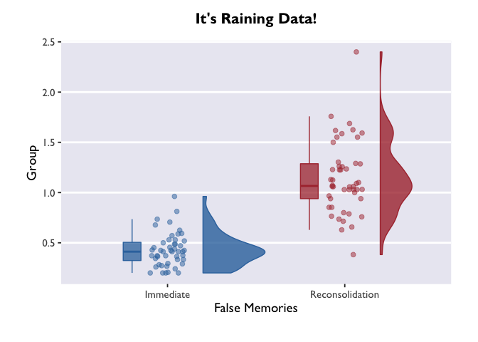
Raincloud Plots
In the final section, we’ll use our new layering skills to create a
raincloud plot! These are pretty plots that display the distribution of
your data, as well as the summary metrics for comparison.
1
2
3
4
5
6
7
8
9
10
11
12
13
14
15
16
17
18
19
20
21
22
23
24
25
#we'll borrow this function that allows us to plot half violin plots
source("https://raw.githubusercontent.com/datavizpyr/data/master/half_flat_violinplot.R", local = knitr::knit_global())

#this is the same as the palette we generated earlier, but we need to specify it for COLOR instead of FILL (allowing us to apply it to dots in addition to bars)
scale_color_dragon <- function(...){
      library(scales)
      discrete_scale("color","dragon",manual_pal(values = c("#3574AC","#AD343C","#FBD774")), ...)
}

#think through what each of these layers adds to the plot. try turning them off and on!
#try enabling or disabling coord_flip() to change the orientation.

ggplot(data = PE_recon, aes(x = Group, y = Errors_mean, fill = Group, color = Group)) +
theme_allie() +
geom_flat_violin(position = position_nudge(x = .2, y = 0), alpha = .8, width = 0.7) +
geom_jitter(width = 0.1, height = 0, size = 2, alpha = 0.5) +
geom_boxplot(width = .1, alpha = 0.75, position = position_nudge(x = -.2, y = 0), outlier.shape = NA) +
scale_fill_dragon() +
scale_color_dragon() +
guides(fill = FALSE) +
guides(color = FALSE) +
#coord_flip() +
xlab("False Memories") +
ylab("Group") +
ggtitle("It's Raining Data!")
If we call ggplot() without specifying any variables, it just generates a blank square! This is actually the bottom layer of every plot. It’s a blank slate, waiting for us to layer data on top.
Let’s say our first research question is whether the color of the dragon is related to its intelligence. What happens when we specify those variables, but don’t add any geoms? We initialize a grid and axes, but don’t actually plot any data.
1
ggplot(data = dragons, aes(x = color, y = breathesFire))
1
2
# if we wanted to save the plot in our current working directory, we could run the line below.
#ggsave("dragon_color.png", dpi = 300, width = 4, height = 4, units = "in")
The biggest difference between plotting in the emmeans-verse and in
the way Allie showed above is that your y variable will almost always be
“emmean” and you don’t have to compute confidence intervals yourself.
But if you want to add information about the raw data (like the jitter
above), then you’ll need to add a layer that takes data from the source
dataframe. Note that you only need to specify the dimension on which
your variable is different from the one in the main ggplot call – i.e.,
I only had to specify y=testScore in the geom_jitter() call.
1
2
3
4
5
6
7
8
9
ggplot(model_df, aes(x = color, y = emmean, fill = color)) +
  scale_fill_dragon("Dragon Color") +
  geom_col() +
  geom_errorbar(aes(ymin=lower.CL, ymax=upper.CL), width = 0.4, size = 1) +
  geom_jitter(data=dragons, aes(y=testScore), width = 0.1, height = 0, alpha = 0.2) +
  xlab("Dragon Color") +
  ylab("Cognitive Test Score") +
  ggtitle("Test Score by Color") +
  theme_allie()
Three things to note: first, we indicate that we want to extract
marginal means for the main terms and interactions with the | operator
(did you know it’s called a ‘pipe’??? TIL!). The * operator will do
exactly the same thing, and it has the added benefit of being more
similar to lmer syntax.
Second, we made another Stroop plot! The colors of the geoms don’t match the color names, and we no longer have Allie’s beautiful colors. Unfortunately, this shows the limits of custom color palettes – since they’re hard-coded, they need to have enough colors to cover all the different combinations of your discrete variables. So if you wanted to make an interaction plot like this with the same colors as Allie’s, you’d need to make another palette that has 9 values instead of 3.
Third, we have two legends! One where the geoms are colored and another
where they are black. This highlights the difference between the color
and fill arguments. Color is used to set the color of line-based
objects, like the outline of a bar, violin, ribbon, etc. It’s also used
to set the color of points. Given that our geom is a combination of
point & line, it’s only going to be modifiable by color arguments.
Fill is used to “fill in” empty spaces, like the inside of a column,
ribbon, or violin. Since we don’t have any geoms that take the fill
argument in this plot, then it just shows up as black. Getting rid of
fill=color and scale_fill_dragon() will get rid of the superfluous
legend.
Cool! The trends are still there, but now we have a more detailed depiction of how the probability of fire-breathing changes as a function of body length.
emmeans
is an immensely useful companion package for lme4 and lmerTest. The
vignettes on the page linked here are very helpful, and can be quite
illuminating about all the things you can do with fitted mixed models. I
highly recommend playing around with it to build up your knowledge about
mixed models!
And once you get familiar with emmeans & lmer, you can take the
fast-track to plotting model estimates:
1
2
3
4
5
6
7
8
9
10
glmer(breathesFire ~ color*bodyLength + (1|mountainRange), data=dragons, family=binomial(link = "logit")) %>%
  emmeans(., ~ color*bodyLength, type='response', at=list(bodyLength=bodyLength_range('bodyLength'))) %>%
  as.data.frame() %>%
  ggplot(., aes(x=bodyLength, y=prob,fill=color)) +
  geom_ribbon(aes(ymin=asymp.LCL, ymax=asymp.UCL), alpha=0.3) +
  geom_line(aes(color=color)) +
  scale_fill_dragon("Dragon Color") +
  scale_color_manual(values=c("#3574AC","#AD343C","#FBD774")) +
  labs(y='Probability of breathing fire', x='Body Length', color='Dragon Color',title='Effects of color and body length on fire-breathing') +
  theme_allie()
1
2
3
# create the palette
dragon_fill <- get_scale_fill(get_pal(dragon_colors))
dragon_color <- get_scale_color(get_pal(dragon_colors))
angle adjusts the angle (setting it to 90 would make the labels
perpendicular to the plot), and vjust and hjust move the labels
along the vertical and horizontal dimensions.
If you don’t like the legend on top, you can adjust that very simply:
1
p + theme_pubr(legend='right')
To adjust the position of your legend, or really anything about the
plotting space that doesn’t have to do with geoms (so things like axes,
backgrounds, text size, etc.), you’ll pass a command to the theme()
function of ggplot. Something I can’t recommend highly enough is taking
time to learn about and play around with all the different arguments
that can be passed to theme(). That’s where the vast majority of
customization comes in!
An important note: the layering of arguments within a ggplot object does
indeed matter. Geoms get stacked on top of each other based on the order
they’re listed. So if you want to overlay a jitter on top of a bar plot,
you need to make sure geom_jitter comes after geom_col. Likewise
with theme arguments that aren’t included in the base ggplot2
package. If you specify, for example, theme_pubr(legend='right'), but
then add legend.position='center' in your theme() call that comes
after the theme_pubr() call, then your legend is going to be placed in
the location of the most recent call; in this example, it would be
centered. I’ve run into this with things like font styles before, and
endured a fair share of head-bashing before realizing what I was doing.
Please learn from my mistakes!
Writing a plotting function
1
2
# and if we wanted to export this figure as one single image, we would run:
#ggsave('filepath', dpi='retina')