
Power Analysis Through Simulation
So, you’re designing an experiment and you’re faced with answering the age-old question: How many participants do I need for this experiment to work? Probably, your advisor sent you down a barren path of finding a power analysis tool that will work for your particular design, hopefully at least with the good intention of hopping on the open/reproducible science bandwagon. But, if you’ve looked, you’ll have noticed that most of those sorts of pacakges aren’t exactly easy to use, and worse is that they don’t work for all sorts of experimental designs.
Well, if this sounds like you, I’ve got some good news and some bad news. The good news is that, in principle, there is a fantastic way to determine power for pretty much any experimental design and statistical analysis you might be interested in. The bad news is that you will have to work, and more importantly think, to get the results you want.
The main idea
The reason that it can be difficult to precisely calculate power for certain experiments is that some poor schmuck has to mathematically derive a formula for each experimental design. There might be some overlap between similar cases, but in many cases doing the math right is just really hard. So, more recently, the simulation approach to power analysis has been becoming more and more popular, since it is relatively simple & easy to implement, and provides results that are quantitatively just as good. The only downside is that, as you’ll see, running the simulations can sometimes take a really long time.
The simulation-based approach has 5 main steps:
- Decide on the a-priori effect size of interest
- Simulate some data assuming that effect size
- Analyze the model and check if the effect is significant
- Repeat 2-3 until you’re confident enough
- Repeat 2-4 for a range of possible sample sizes
A simple example
To start, let’s use one of the most simple designs possible: a
one-sample t-test, which tests whether the mean of some value is equal
to some reference value like 0. Let’s say you’re studying moral
judgments on a scale from -1 to 1, where -1 indicates that people
think an action was immoral and 1 indicates that they think it is
morally praiseworthy (and 0 is neutral). We want to know whether
people think that forcing your friends to sit through Minions 2: The
Rise of Gru is morally wrong.
The first thing we need to do is decide on our effect size. In this
case, let’s assume that people think that it is morally wrong (I mean,
come on), with a true value of -.4. We also expect people to vary, say
with a standard deviation of .3.
Once we’ve decided, we can simulate a dataset with these “true” values:
1
2
3
4
5
6
7
8
9
10
11
library(tidyverse)
library(emmeans)
library(viridis)
library(gganimate)
library(mvtnorm)
library(lme4)
library(lmerTest)

d <- tibble(participant=1:10) %>%
    mutate(moral_judgment=rnorm(n(), mean=-.4, sd=.3))
d
1
2
3
4
5
6
7
8
9
10
11
12
13
## # A tibble: 10 × 2
##    participant moral_judgment
##          <int>          <dbl>
##  1           1         -0.412
##  2           2         -1.01
##  3           3         -0.234
##  4           4         -0.478
##  5           5         -0.562
##  6           6         -0.538
##  7           7         -0.476
##  8           8         -0.643
##  9           9         -0.237
## 10          10          0.141
As you can see, we’ve created a tibble (a dataframe) with 10
participants, whose moral judgments are normally distributed around
-.4 with a standard deviation of .3. In this case, we could’ve just
used the rnorm function to get a vector of judgments, but in the
future it’ll be easier to keep things in a tibble. The next thing we
want to do is run our test of interest:
1
2
t <- t.test(d$moral_judgment)
t
1
2
3
4
5
6
7
8
9
10
11
##
##  One Sample t-test
##
## data:  d$moral_judgment
## t = -4.6858, df = 9, p-value = 0.001143
## alternative hypothesis: true mean is not equal to 0
## 95 percent confidence interval:
##  -0.6589673 -0.2298638
## sample estimates:
##  mean of x
## -0.4444155
This gives us the mean moral judgment, a t-value, the degrees of
freedom, confidence intervals, and a p-value. That’s a lot of
information, but in power analysis people are typically interested in
just the p-value. We can test for “significance” by comparing the
p-value to a cutoff like .05:
1
t$p.value < .05
1
## [1] TRUE
And look at that, our result was significant! Sadly, this alone doesn’t
really tell us anything, since our actual experiment could be completely
different due to sampling variation. So we need to be able to quantify
our uncertainty about power across possible replications of the
experiment. The solution is that we can repeat this process a large-ish
number of times (step 4). To do this, I’m going to make use of
tidyverse’s list-columns, which allow you to store dataframes or lists
inside of a column of an outer data-frame. So, let’s first make our
dataframe a hundred times larger than it already is:
1
2
3
d <- expand_grid(simulation=1:100, participant=1:10) %>%
    mutate(moral_judgment=rnorm(n=n(), mean=-.2, sd=.3))
d
1
2
3
4
5
6
7
8
9
10
11
12
13
14
## # A tibble: 1,000 × 3
##    simulation participant moral_judgment
##         <int>       <int>          <dbl>
##  1          1           1       -0.458
##  2          1           2       -0.650
##  3          1           3       -0.478
##  4          1           4        0.356
##  5          1           5        0.203
##  6          1           6       -0.0851
##  7          1           7       -0.103
##  8          1           8       -0.247
##  9          1           9       -0.0446
## 10          1          10        0.00239
## # … with 990 more rows
You can see that we have 100 simulations of our 10-participant
dataset all wrapped up in the same dataframe. We can make it tidier
using the function nest, which wraps up the dataset for each
simulation:
1
2
d <- d %>% group_by(simulation) %>% nest()
d
1
2
3
4
5
6
7
8
9
10
11
12
13
14
15
## # A tibble: 100 × 2
## # Groups:   simulation [100]
##    simulation data
##         <int> <list>
##  1          1 <tibble [10 × 2]>
##  2          2 <tibble [10 × 2]>
##  3          3 <tibble [10 × 2]>
##  4          4 <tibble [10 × 2]>
##  5          5 <tibble [10 × 2]>
##  6          6 <tibble [10 × 2]>
##  7          7 <tibble [10 × 2]>
##  8          8 <tibble [10 × 2]>
##  9          9 <tibble [10 × 2]>
## 10         10 <tibble [10 × 2]>
## # … with 90 more rows
As you can see, now we have one row per simulation, and a new data
column that contains the dataset for each simulation. We can confirm
that the datasets look like our old ones by picking one out (Here I’m
using R’s double brackets instead of single brackets (d$data[1]) since
the data column is a list-column):
1
d$data[[1]]
1
2
3
4
5
6
7
8
9
10
11
12
13
## # A tibble: 10 × 2
##    participant moral_judgment
##          <int>          <dbl>
##  1           1       -0.458
##  2           2       -0.650
##  3           3       -0.478
##  4           4        0.356
##  5           5        0.203
##  6           6       -0.0851
##  7           7       -0.103
##  8           8       -0.247
##  9           9       -0.0446
## 10          10        0.00239
Cool- so now we have 100 datasets. As before, we want to calculate a
t-test for each possible dataset. To do that, we need to make use of the
map function:
1
2
d <- d %>% mutate(t.test=map(data, ~ t.test(.$moral_judgment)))
d
1
2
3
4
5
6
7
8
9
10
11
12
13
14
15
## # A tibble: 100 × 3
## # Groups:   simulation [100]
##    simulation data              t.test
##         <int> <list>            <list>
##  1          1 <tibble [10 × 2]> <htest>
##  2          2 <tibble [10 × 2]> <htest>
##  3          3 <tibble [10 × 2]> <htest>
##  4          4 <tibble [10 × 2]> <htest>
##  5          5 <tibble [10 × 2]> <htest>
##  6          6 <tibble [10 × 2]> <htest>
##  7          7 <tibble [10 × 2]> <htest>
##  8          8 <tibble [10 × 2]> <htest>
##  9          9 <tibble [10 × 2]> <htest>
## 10         10 <tibble [10 × 2]> <htest>
## # … with 90 more rows
The map function is pretty sweet if you ask me: it takes a list-column
(like d$data), and a function, and applies that function to each
element of the list-column. In our case, we used a formula syntax to
define something called an anonymous function, which is just like any
old function except you don’t care about it enough to give it a name.
Notably, the formula syntax is probably slightly different than you
might’ve seen before in R. The tilde (~) tells R that we’re defining a
function. Everything to the right of the tilde is what the function
computes: in our case, we’re just running a t-test. Finally, the period
(.) is a placeholder for whatever dataset is getting passed to
t.test. If we want to extract particular information from the analyses
(like the p-values), we can use map again:
1
2
3
d <- d %>% mutate(p.value=map_dbl(t.test, ~ .$p.value),
                  significant=p.value < .05)
d
1
2
3
4
5
6
7
8
9
10
11
12
13
14
15
## # A tibble: 100 × 5
## # Groups:   simulation [100]
##    simulation data              t.test  p.value significant
##         <int> <list>            <list>    <dbl> <lgl>
##  1          1 <tibble [10 × 2]> <htest> 0.163   FALSE
##  2          2 <tibble [10 × 2]> <htest> 0.0376  TRUE
##  3          3 <tibble [10 × 2]> <htest> 0.417   FALSE
##  4          4 <tibble [10 × 2]> <htest> 0.210   FALSE
##  5          5 <tibble [10 × 2]> <htest> 0.0102  TRUE
##  6          6 <tibble [10 × 2]> <htest> 0.0405  TRUE
##  7          7 <tibble [10 × 2]> <htest> 0.0379  TRUE
##  8          8 <tibble [10 × 2]> <htest> 0.0562  FALSE
##  9          9 <tibble [10 × 2]> <htest> 0.00281 TRUE
## 10         10 <tibble [10 × 2]> <htest> 0.00431 TRUE
## # … with 90 more rows
Here I’ve used map_dbl instead of regular-old map to ensure that our
p.value column is a regular number column, not a list column.
From here we have everything we need to calculate power! To make sure we get a power estimate with good confidence intervals, I’m going to use a logistic regression to predict the rate of significance (given we know the effect is real):
1
2
power <- glm(significant ~ 1, data=d, family='binomial')
summary(power)
1
2
3
4
5
6
7
8
9
10
11
12
13
14
15
16
17
18
19
##
## Call:
## glm(formula = significant ~ 1, family = "binomial", data = d)
##
## Deviance Residuals:
##    Min      1Q  Median      3Q     Max
## -1.093  -1.093  -1.093   1.264   1.264
##
## Coefficients:
##             Estimate Std. Error z value Pr(>|z|)
## (Intercept)  -0.2007     0.2010  -0.998    0.318
##
## (Dispersion parameter for binomial family taken to be 1)
##
##     Null deviance: 137.63  on 99  degrees of freedom
## Residual deviance: 137.63  on 99  degrees of freedom
## AIC: 139.63
##
## Number of Fisher Scoring iterations: 3
Sadly this estimate isn’t super helpful since our intercept is on the
scale of log-odds. Also, don’t get worked up about whether the intercept
is “significant”, since this is just testing against a power of .5
(which is not what we want). To get more useable estimates and
confidence intervals, we can use emmeans:
1
emmeans(power, ~1, type='response')
1
2
3
4
5
##  1       prob     SE  df asymp.LCL asymp.UCL
##  overall 0.45 0.0497 Inf     0.356     0.548
##
## Confidence level used: 0.95
## Intervals are back-transformed from the logit scale
This tells us that for a dataset of size 10, we have a pretty poor power of 45% [35.6%, 54.8%].
So… about that sample size…
We’re so close to being able to answer our question about sample size, but somehow we still don’t know how many participants to run. To do that, we need to repeat the entire process above for a range of sample sizes, until we find one that gives us the power we need. Thankfully, since we went through the effort of using nested data-frames, it’s pretty easy to extend what we already have:
1
2
3
4
5
6
7
d.t2 <- expand_grid(N=2:40, simulation=1:100) %>%
    group_by(N, simulation) %>%
    mutate(data=list(tibble(participant=1:N, moral_judgment=rnorm(n=N, mean=-.2, sd=.3))),
           t.test=map(data, ~ t.test(.$moral_judgment)),
           p.value=map_dbl(t.test, ~ .$p.value),
           significant=p.value < .05)
d.t2
1
2
3
4
5
6
7
8
9
10
11
12
13
14
15
## # A tibble: 3,900 × 6
## # Groups:   N, simulation [3,900]
##        N simulation data             t.test  p.value significant
##    <int>      <int> <list>           <list>    <dbl> <lgl>
##  1     2          1 <tibble [2 × 2]> <htest>  0.113  FALSE
##  2     2          2 <tibble [2 × 2]> <htest>  0.656  FALSE
##  3     2          3 <tibble [2 × 2]> <htest>  0.879  FALSE
##  4     2          4 <tibble [2 × 2]> <htest>  0.150  FALSE
##  5     2          5 <tibble [2 × 2]> <htest>  0.333  FALSE
##  6     2          6 <tibble [2 × 2]> <htest>  0.468  FALSE
##  7     2          7 <tibble [2 × 2]> <htest>  0.0928 FALSE
##  8     2          8 <tibble [2 × 2]> <htest>  0.654  FALSE
##  9     2          9 <tibble [2 × 2]> <htest>  0.228  FALSE
## 10     2         10 <tibble [2 × 2]> <htest>  0.451  FALSE
## # … with 3,890 more rows
As before, we have a single dataset per row, except now the datasets vary by size. To generate a power curve, we can predict power as a function of sample size (treating sample size as a factor variable to estimate the power for each size independently):
1
2
3
4
5
6
7
8
9
power.t2 <- glm(significant ~ factor(N), data=d.t2, family='binomial')

emmeans(power.t2, ~ N, type='response') %>%
    as.data.frame %>%
    mutate(asymp.LCL=ifelse(asymp.LCL<1e-10, 1, asymp.LCL)) %>%   ## remove unneccesarily large error bars
    ggplot(aes(x=N, y=prob, ymin=asymp.LCL, ymax=asymp.UCL)) +
    geom_hline(yintercept=.8, linetype='dashed') +
    geom_ribbon(fill='red', alpha=.25) + geom_line(color='red', size=1) +
    xlab('Sample Size') + ylab('Power') + theme_classic()
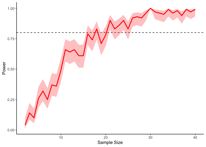
If we’re interested in a power of 80% (i.e., an 80% probability of detecting a significant result), then, we will need at least 20 or so participants in our experiment (indicated by the dashed line). Of course these results are fairly noisy, but we can always get tighter confidence intervals by running more simulations:
1
2
3
4
5
6
7
8
9
10
11
12
13
14
d.t3 <- expand_grid(N=2:40, simulation=1:1000) %>%
    group_by(N, simulation) %>%
    mutate(data=list(tibble(participant=1:N, moral_judgment=rnorm(n=N, mean=-.2, sd=.3))),
           t.test=map(data, ~ t.test(.$moral_judgment)),
           significant=map_lgl(t.test, ~ .$p.value < .05))

power.t3 <- glm(significant ~ factor(N), data=d.t3, family='binomial')

emmeans(power.t3, ~ N, type='response') %>%
    as.data.frame %>%
    ggplot(aes(x=N, y=prob, ymin=asymp.LCL, ymax=asymp.UCL)) +
    geom_hline(yintercept=.8, linetype='dashed') +
    geom_ribbon(fill='red', alpha=.25) + geom_line(color='red', size=1) +
    xlab('Sample Size') +ylab('Power') + theme_classic()
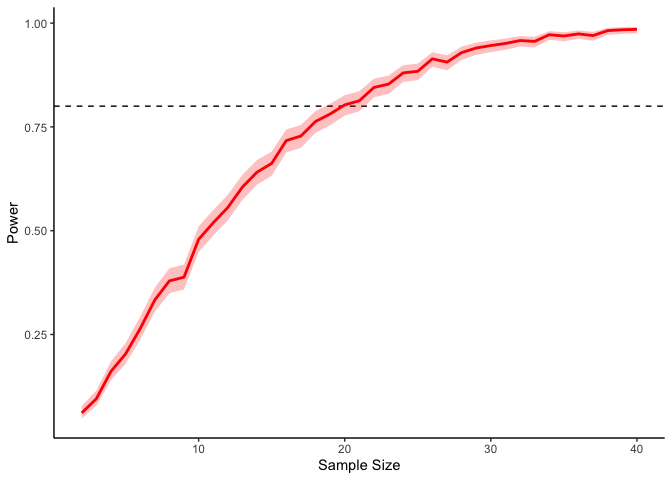
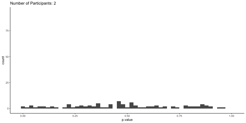
This should take a bit longer, but we can see the results are definitely less noisy. If you’re interested, you can also look at other quantities given by the t-tests, like the p-values themselves. Here we can look at the effect of power on distributions of possible p-values:
1
2
3
4
5
6
ggplot(d.t3, aes(x=p.value)) a+
    geom_histogram(binwidth=.02) +
    theme_classic() +
    transition_time(N) +
    ggtitle('Number of Participants: {frame_time}') %>%
    animate(height=400, width=800)
This confirms the plot above, that with increasing sample size our p-values should get closer to zero.
What if I don’t know the size of my effect?
The above simulation is all well and good, but it assumes that you already know how large your effect should be. If you’re working on a new effect, you’re pretty much SOL. One thing we can try is to vary the true effect size and construct a power curve for each:
1
2
3
4
5
6
7
8
9
10
11
12
13
14
15
16
17
18
d.t4 <- expand_grid(N=2:40, simulation=1:1000, effect_size=seq(0, 1.5, .25)) %>%
    group_by(N, simulation, effect_size) %>%
    mutate(data=list(tibble(participant=1:N, moral_judgment=rnorm(n=N, mean=effect_size, sd=1))),
           t.test=map(data, ~ t.test(.$moral_judgment)),
           significant=map_lgl(t.test, ~ .$p.value < .05))

power.t4 <- glm(significant ~ factor(N) * factor(effect_size), data=d.t4, family='binomial')

emmeans(power.t4, ~ N * effect_size, type='response') %>%
    as.data.frame %>%
    mutate(asymp.LCL=ifelse(asymp.LCL<1e-10, 1, asymp.LCL)) %>%   ## remove unneccesarily large error bars
    ggplot(aes(x=N, y=prob, ymin=asymp.LCL, ymax=asymp.UCL, group=effect_size)) +
    geom_hline(yintercept=.8, linetype='dashed') +
    geom_ribbon(aes(fill=factor(effect_size)), alpha=.25) +
    geom_line(aes(color=factor(effect_size)), size=1) +
    scale_color_viridis(name='Effect Size', discrete=TRUE) +
    scale_fill_viridis(name='Effect Size', discrete=TRUE) +
    xlab('Sample Size') + ylab('Power') + theme_classic()
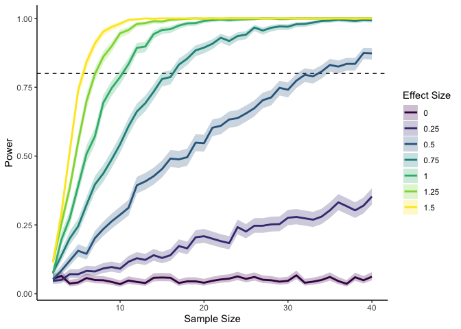
Here I’m using a standardized effect size—the mean divided by the standard deviation—so that I don’t need to vary both the mean and the standard deviation. We can see that if we have a large effect, we don’t need many datapoints to reach 80% power. With an effect smaller than .5, though, we quickly start to need a lot more data points for the same amount of power.
More Complex Designs
The main advantage of the simulation-based approach to power analysis is that once we know the basic process, it’s really easy to do the same thing for all kinds of experimental designs and statistical analyses.
Correlational designs
For example, we can do a power analysis for correlational designs by tweaking our code slightly:
1
2
3
4
5
6
7
8
9
10
11
12
13
14
15
16
17
r <- .4
d.corr <- expand_grid(N=seq(5, 75, 5), simulation=1:100) %>%
    group_by(N, simulation) %>%
    mutate(data=rmvnorm(N, mean=c(0, 0), sigma=matrix(c(1, r, r, 1), ncol=2)) %>%
               as.data.frame() %>%
               list(),
           cor.test=map(data, ~ cor.test(.$V1, .$V2)),
           significant=map_lgl(cor.test, ~ .$p.value < .05))

power.corr <- glm(significant ~ factor(N), data=d.corr, family='binomial')

emmeans(power.corr, ~ N, type='response') %>%
    as.data.frame %>%
    ggplot(aes(x=N, y=prob, ymin=asymp.LCL, ymax=asymp.UCL)) +
    geom_hline(yintercept=.8, linetype='dashed') +
    geom_ribbon(fill='red', alpha=.25) + geom_line(color='red', size=1) +
    xlab('Sample Size') +ylab('Power') + theme_classic()
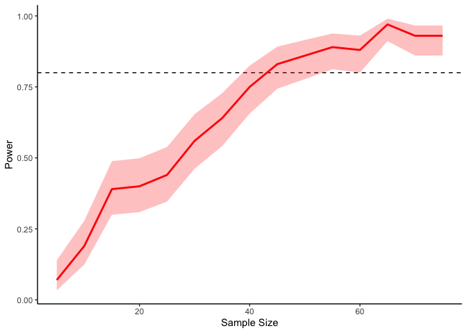
In the above code I’m sampling two variables from a multivariate normal
distribution with zero means, unit standard deviations, and a
correlation of .4. Our simmulation here says that we need a sample
size of at least 50 or so to get 80% power.
Repeated measures
If we have repeated measures, we just need to make sure that we simulate our data so that each participant actually has repeated measures. One way is to assume (a la mixed effects models) that people’s individual means are normally distributed around the grand mean, and their responses are normally distributed around that. Let’s try a two-way repeated measures design with a control and experimental condition:
1
2
3
4
5
6
7
8
9
10
11
12
13
14
15
16
17
18
19
20
21
22
23
24
25
26
27
effect_size <- 0.4
participant_sd <- 0.5

d.lmer <- expand_grid(N_participants=c(5, 10, 25, 50), N_trials=c(5, 10, 25, 50), simulation=1:100) %>%
    group_by(N_participants, N_trials, simulation) %>%
    mutate(data=expand_grid(participant=1:N_participants, trial=1:N_trials) %>%
               group_by(participant) %>%
               mutate(participant_intercept=rnorm(n(), 0, participant_sd)) %>%
               ungroup() %>%
               mutate(x=ifelse(trial <= N_trials/2, 'Control', 'Manipulation'),
                      y=rnorm(n(), ifelse(x=='Control', participant_intercept,
                                          effect_size+participant_intercept), 1)) %>%
               list(),
           lmer=map(data, ~ lmer(y ~ x + (1|participant), data=.)),
           significant=map_lgl(lmer, ~ coef(summary(.))[2,5] < .05))

power.lmer <- glm(significant ~ factor(N_participants) * factor(N_trials), data=d.lmer, family='binomial')

emmeans(power.lmer, ~ N_participants*N_trials, type='response') %>%
    as.data.frame %>%
    mutate(asymp.LCL=ifelse(asymp.LCL<1e-10, 1, asymp.LCL)) %>%   ## remove unneccesarily large error bars
    ggplot(aes(x=N_participants, y=prob, ymin=asymp.LCL, ymax=asymp.UCL, group=N_trials)) +
    geom_hline(yintercept=.8, linetype='dashed') +
    geom_ribbon(aes(fill=factor(N_trials)), alpha=.25) + geom_line(aes(color=factor(N_trials)), size=1) +
    scale_color_viridis(name='Number of Trials\nPer Participant', discrete=TRUE) +
    scale_fill_viridis(name='Number of Trials\nPer Participant', discrete=TRUE) +
    xlab('Sample Size') +ylab('Power') + theme_classic()
As you can tell, simulating within-participant data is slightly
trickier, since we needed to first randomly sample participant-level
intercepts before sampling their responses using those means. However,
the process is the same overall, where we create a grid of modeling
conditions (here I’m looking at number of participants and number of
trials per participant), create a fake dataset within each one of those
conditions, look for a significant difference, and finally use a
logistic regression to figure out how much power we have in each case.
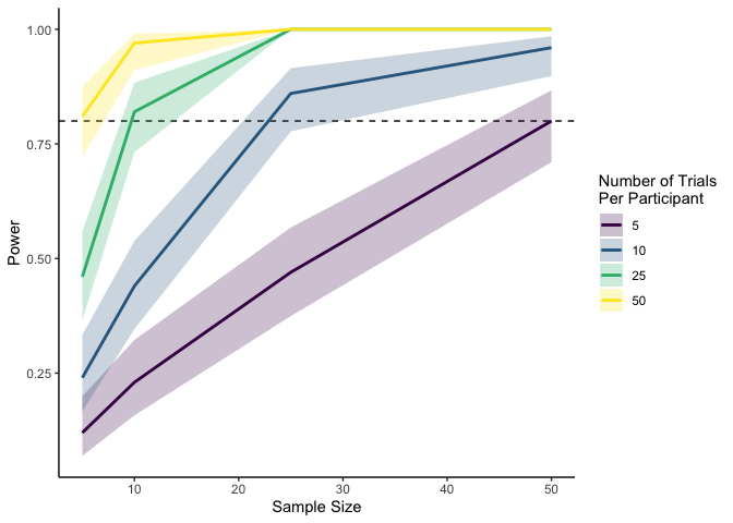
The plot above tells us that for an effect size of .4 with a
participant-level standard deviation of .5, the number of participants
we need depends on how many trials each participant completes. In this
case, we need 50 participants if each is completing only 5 trials, but
only 5 participants if each is completing 50 trials. Neat!
Wrapping up
It might seem like we haven’t covered a ton today, but the beauty of the simulation-based approach to power analysis is that if you can simulate data for your experiment, then you can calculate power in exactly the same way we’ve been doing! For many (most) design changes (e.g. using categorical vs continuous variables, changing distribution families or link functions, adding covariates), the process is exactly the same. But as your design gets more complex, it will take more effort to simulate, and generally you will have to make more assumptions to calculate power. For instance, in the repeated measures case, we have to make an assumption about how the participant-level means are distributed, in addition to the overall effect size. If we wanted to add random slopes, we would also need to make assumptions about the distribution of those random slopes, as well as the correlation between the random slopes and intercepts. But the basic process is always the same.
However, there’s always more to learn! For one, you probably have noticed that these simulations can quickly take up some CPU time, especially if you’re varying many different simulation parameters or using really big datasets. In this case, it is useful to run simulations in parallel. Thankfully, since this case is what’s known as embarrassingly parallel (i.e., none of the individual simulations depend on each other, it is very easy to speed up. Another extension is to look at power analyses for Bayesian statistics, where we work with distributions of true values instead of fixed true values (Solomon Kurz has a wonderful blog post series on the topic. Hopefully we’ll get to cover these topics in future meetings!