Fitting drift-diffusion models with simulation
Last week, Raphael presented a fantastic conceptual introduction to drift diffusion models, which are an extension of signal detection models over time. Here I’ll be talking about what model fitting is, how it works, and how to fit these DDM models to your data.
Model fitting
How do people fit models, and what does it even mean to fit a model? Let’s say you have some data \(y\), and you want to be able to say something about it. Typically, when people refer to a model, they are talking about a set of equations that take some parameters, \(\theta\), and output a value \(\hat{y}\) with some probability \(p(\hat{y} \vert \theta)\). Obviously, if we want to say anything useful about \(y\), we want to make sure that \(\hat{y}\) is as close to \(y\) as possible. To do that, we need to find the best \(\theta\)s to line up your \(\hat{y}\)’s according to \(y\). This process of finding the best \(\theta\)s is called maximum likelihood estimation, since we are in the business of finding the \(\theta\)s for which the likelihood \(p(y \vert \theta)\) is largest.
In an ideal world, we would be able to derive an analytical formula for
the likelihood. Then, to find its maximum, we would just need to take
its derivative with respect to \(\theta\), set it to 0, and solve,
just like you do in calculus class. For many models that people care
about, this has been done long ago by someone much smarter than I.
Sadly, however, this approach doesn’t work if the likelihood is
non-convex, or if you don’t have a good way of writing down the
likelihood in a neat differentiable formula.
So, today we’re going to talk about the complete opposite end of the spectrum. Whereas the analytic approach is difficult but makes things easy in the long run, simulation-based approaches are incredibly easy, but can take more time in the long run. Nevertheless, it’s a great way to understand what’s going on in model fitting, and for that reason it makes a great exercise for us today.
Drift Diffusion Models
First, we need a model to simulate. So, let’s load some packages, and
define a ddm function, which is just a refactored version of
(Raphael’s drift diffusion code from last
post)[https://dibsmethodsmeetings.github.io/drift-diffusion-models/].
1
2
3
4
5
6
7
8
9
10
11
12
13
14
15
16
17
18
19
20
21
22
23
24
25
26
27
28
29
30
31
32
33
34
35
36
37
38
library(tidyverse)
library(patchwork)
library(viridis)
library(multidplyr)

#' ddm: simulate from a drift diffusion model
#'
#' @param sims Number of DDM simulations to run.
#' @param samples Number of samples to accumulate per simulation.
#' @param drift The average evidence accumulated per sample.
#' @param sd The standard deviation of evidence accumulated per sample.
#' @param threshold The amount of evidence required to make a decision.
#' @param bias The amount of evidence at the start of each simulation.
#' @param ndt The non-decision-time, the amount of time before evidence begins to accumulate.
#' @return a [sims x 9] nested dataframe consisting of the following columns:
#'
#' sim: the simuluation number
#' data: a dataframe consisting of the evidence accumulated each sample
#' rt: the number of samples before the evidence exceeded threshold
#' response: the response made this simulation (-1 or 1)
#' drift, sd, threshold, bias, ndt: the DDM parameters for the simulation
#'
#' Note: the dataframe will contain NAs for rt and response if the model did
#' not make a decision at the end of the simulation period.
ddm <- function(sims=1, samples=100, drift=0, sd=1, threshold=1, bias=0, ndt=0) {
    expand_grid(sim=1:sims,
                sample=1:samples) %>%
        group_by(sim) %>%
        mutate(evidence=cumsum(c(bias, rep(0, ndt),
                                 rnorm(samples-ndt-1, mean=drift, sd=sd)))) %>%
        nest() %>%
        mutate(rt=map_dbl(data, function(d) detect_index(d$evidence,
                                                         ~ abs(.) > threshold, .default=NA)),
               response=map_dbl(data, ~ ifelse(is.na(rt), NA, sign(.$evidence[rt]))),
               data=map(data, ~ filter(., is.na(rt) | sample <= rt)),
               ## store the DDM parameters for later
               drift=drift, sd=sd, threshold=threshold, bias=bias, ndt=ndt)
}
I won’t go into too much detail about this since Raphael covered this already, but essentially we’re just taking the cumulative sum of a bunch of normally distributed samples, and making a response when that sum crosses a threshold. We can use this function to simulate some data. Here we’re going to assume default values for the random walk standard deviation, the bias, and the non-decision time, and I’m going to use secret values for the drift and the threshold:
1
2
3
4
## simulate some "real" data
y <- ddm(10000, 1000, drift=DRIFT, threshold=THRESHOLD) %>%
    select(sim:response)
y
1
2
3
4
5
6
7
8
9
10
11
12
13
14
15
## # A tibble: 10,000 × 4
## # Groups:   sim [10,000]
##      sim data                  rt response
##    <int> <list>             <dbl>    <dbl>
##  1     1 <tibble [99 × 2]>     99       -1
##  2     2 <tibble [238 × 2]>   238       -1
##  3     3 <tibble [71 × 2]>     71        1
##  4     4 <tibble [171 × 2]>   171        1
##  5     5 <tibble [633 × 2]>   633        1
##  6     6 <tibble [61 × 2]>     61        1
##  7     7 <tibble [140 × 2]>   140        1
##  8     8 <tibble [422 × 2]>   422       -1
##  9     9 <tibble [170 × 2]>   170        1
## 10    10 <tibble [130 × 2]>   130        1
## # … with 9,990 more rows
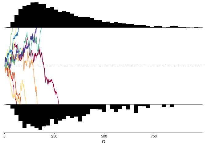
Next, let’s write out a plotting function, which will help us simultaneously look at the reaction time histograms for each response, as well as some sample traces of the evidence accumulation process:
1
2
3
4
5
6
7
8
9
10
11
12
13
14
15
16
17
18
19
20
21
22
23
24
25
26
27
28
29
30
31
32
33
34
35
36
37
38
39
40
41
42
43
44
45
46
47
48
49
50
51
52
53
54
55
56
57
58
59
60
#' ddm_plot
#'
#' @param d A nested dataframe of DDM simulations, created using a call to `ddm`.
#' @param sims The number of simulations to plot from each response.
#' @param bins The number of bins in the reaction time histograms.
#' @return a classic DDM plot with randomly selected evidence traces
ddm_plot <- function(d, sims=5, binwidth=20) {
    max_rt <- max(d$rt)

    p.evidence <- d %>%
        na.omit() %>%
        group_by(response) %>%
        sample_n(sims) %>%
        mutate(sim=row_number() * response) %>%
        unnest(data) %>%
        ggplot(aes(x=sample, y=evidence)) +
        geom_hline(yintercept=0, linetype='dashed') +
        geom_line(aes(group=sim, color=factor(sim)),
                  show.legend=FALSE) +
        geom_hline(yintercept=c(-THRESHOLD, THRESHOLD)) +
        coord_cartesian(xlim=c(0, max_rt),
                        ylim=c(-THRESHOLD, THRESHOLD), expand=FALSE) +
        scale_color_brewer(palette='Spectral') +
        theme_void() +
        theme(axis.title=element_blank(),
              axis.text=element_blank(),
              axis.ticks=element_blank(),
              axis.line.x=element_blank(),
              plot.margin=margin())

    p.rt1 <- d %>%
        filter(response==1) %>%
        unnest(data) %>%
        ggplot(aes(x=rt)) +
        geom_histogram(fill='black', binwidth=binwidth) +
        coord_cartesian(xlim=c(0, max_rt), expand=FALSE) +
        theme_void()

    p.rt2 <- d %>%
        filter(response==-1) %>%
        unnest(cols=c(data)) %>%
        ggplot(aes(x=rt)) +
        geom_histogram(fill='black', binwidth=binwidth) +
        scale_y_reverse() +
        coord_cartesian(xlim=c(0, max_rt), expand=FALSE) +
        theme_void()

    p.axis <- d %>%
        ggplot(aes(x=rt)) +
        coord_cartesian(xlim=c(0, max_rt), expand=FALSE) +
        theme_classic() +
        theme(axis.title.y=element_blank(),
              axis.text.y=element_blank(),
              axis.ticks.y=element_blank(),
              axis.line.y=element_blank())

    (p.rt1 / p.evidence / p.rt2 / p.axis) + plot_layout(heights=c(.33, 1, .33, .01))
}

ddm_plot(y)
Calculating the likelihood
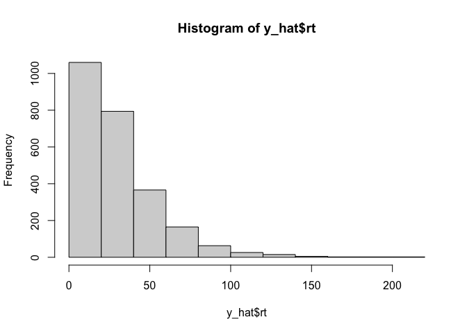
Now that we have our data, we are going to need to figure out how to calculate the liklihood of that data given some drift diffusion model parameters. As I said before, we’re going to use the simple but slow method of simulation: for a given set of parameters, we will simulate some fake data, and use that as an approximate likelihood. The easiest way to do that is to create a simple histogram:
1
2
y_hat <- ddm(2500, 1000, drift=-.05, threshold=5)
hist(y_hat$rt)
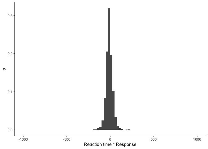
That looks nice, but in addition to the reaction times we also care about the responses made by the model. Conveniently, since the reaction times are always positive, we can hack together a histogram of both variables by simply multiplying them:
1
hist(y_hat$response * y_hat$rt)
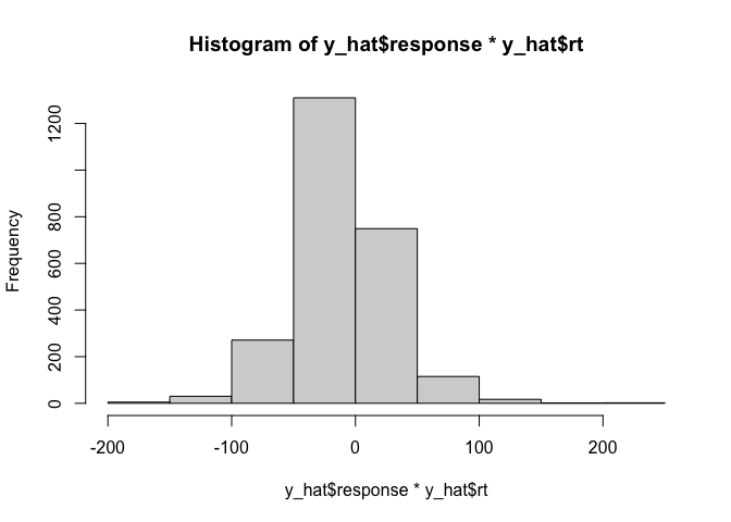
Although this makes it hard to compare the relative reaction times for
the two responses, this tells us that with this arbitrarily chosen set
of parameters we generally have more negative responses than positive
ones, and it gives us what we need: a bunch of unique bins with
different frequencies of simulated data. Now, our likelihood is just the
probability of our simulated data falling into each of these bins!
Thankfully, the hist function also gives us an object containing the
frequencies which we can use to calculate probabilities. Let’s write a
wrapper function to make a histogram that returns our likelihood as a
dataframe:
1
2
3
4
5
6
7
8
9
## create a histogram of x, including a probability column
histogram <- function(x, samples=1000, binwidth=25) {
    x <- x[x >= -samples & x <= samples]
    h <- hist(x, breaks=seq(-samples, samples, by=binwidth), plot=FALSE)
    tibble(lower=h$breaks[-length(h$breaks)], upper=h$breaks[-1],
           mid=h$mids, count=h$counts, p=h$counts/length(x))
}

histogram(y_hat$response * y_hat$rt)
1
2
3
4
5
6
7
8
9
10
11
12
13
14
## # A tibble: 80 × 5
##    lower upper   mid count     p
##    <dbl> <dbl> <dbl> <int> <dbl>
##  1 -1000  -975 -988.     0     0
##  2  -975  -950 -962.     0     0
##  3  -950  -925 -938.     0     0
##  4  -925  -900 -912.     0     0
##  5  -900  -875 -888.     0     0
##  6  -875  -850 -862.     0     0
##  7  -850  -825 -838.     0     0
##  8  -825  -800 -812.     0     0
##  9  -800  -775 -788.     0     0
## 10  -775  -750 -762.     0     0
## # … with 70 more rows
As we can see, this gives us a tibble with one row per bin of the histogram, and we have the lower and upper bounds for each bin, its midpoint, the count/frequency, and the probability. We can plot it to make sure everything looks good:
1
2
3
4
histogram(y_hat$rt * y_hat$response) %>%
    ggplot(aes(x=mid, y=p)) +
    geom_col() + xlab('Reaction time * Response') +
    theme_classic()
This looks similar to before except we now have probabilities on the y-axis! This means that \(p(y_i \vert \theta)\), the likelihood of a single data point \(y_i\) given parameters \(\theta\), is just the height of the bin that \(y_i\) falls into in the histogram. Then, assuming our data points are independently distributed, the likelihood over all of our data is the product of the likelihoods for each data point:
\(p(y \vert \theta) = \prod_{y_i \in y} p(y_i \vert \theta)\).
However, these probabilities can get very small, so to avoid underflow we tend to work with the log likelihood in practice. Using some simple logarithm tricks gives us a better way to calculate the log likelihood:
\[\begin{align*} \textrm{log}\;p(y \vert \theta) &= \textrm{log}\;\prod_{y_i \in y} p(y_i \vert \theta) \\ &= \sum_{y_i \in y} \textrm{log}\; p(y_i \vert \theta) \end{align*}\]So, we can calculate the log-likelihood separately for each data point, and then sum them all up! Since we’re using histograms, we can be even more efficient by making a histogram over both \(y\) and \(\hat{y}\). Then, the sum over all data points in \(y\) turns into a sum over histogram bins, and we end up with something like this:
1
2
3
4
5
6
7
## calculate the likelihood of the data x given the model xhat
## by making histograms of each & summing the proportions in each bin
ll <- function(y, yhat, delta=1e-200, ...) {
    hist_y <- histogram(y, ...)
    hist_yhat <- histogram(yhat, ...)
    sum(hist_y$count * log(hist_yhat$p + delta))
}
Here I’m multiplying the likelihood of each histogram bin of \(y\) by
the number of data points in \(\hat{y}\) that falls into that bin. I’m
also using a small hack here by adding a very tiny number delta to
each probability- this helps us avoid things blowing up when that
probability is 0, in which case log(0) = -Inf. This still allows us
to heavily penalize any model where the likelihood is 0 for a given
histogram bin, while still being able to reasonably compare that to a
slightly worse model where the likelihood is 0 for two different bins.
It also helps with cases where the true likelihood is very small and
non-zero, but our finite number of simulations doesn’t allow us to see
that.
Finally, now we can calculate the log likelihood for our arbitrarily chosen parameters::
1
ll(y$response * y$rt, y_hat$response * y_hat$rt)
1
## [1] -1709601
We can see that the number is very low, which means that the initial
guess isn’t that great. To find a better set of parameters, without any
other help, the best we can do is something called grid search: we
just try out a bunch of different parameter settings at regular
intervals. We can use the tidyverse function expand_grid to help
create that grid:
1
2
3
4
ddm_ll_test <- expand_grid(drift=seq(-.15, .15, .025),
            threshold=seq(1, 20, 1)) %>%
    mutate(ddm_data=map2(drift, threshold, ~ ddm(sims=10, samples=1000, drift=.x, threshold=.y)),
           ll=map_dbl(ddm_data, ~ ll(y$rt*y$response, .$rt*.$response)))
Here I used only a tiny number of simulations per parameter setting, since otherwise it would take a really long time. Let’s see what our likelihood looks like:
1
2
3
4
5
ggplot(ddm_ll_test, aes(x=drift, y=threshold, fill=ll)) +
    geom_raster() +
    geom_point(data=ddm_ll_test %>% filter(ll == max(ll))) +
    scale_fill_viridis() +
    theme_classic()
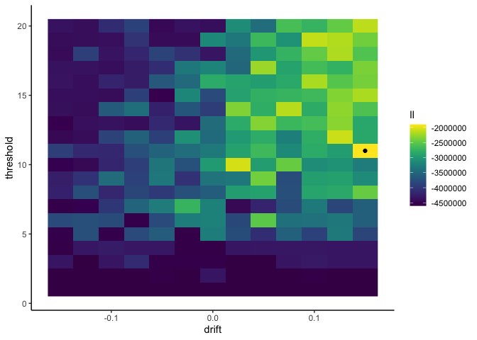
1
ddm_ll_test %>% arrange(desc(ll)) %>% head(1)
1
2
3
4
## # A tibble: 1 × 4
##   drift threshold ddm_data                     ll
##   <dbl>     <dbl> <list>                    <dbl>
## 1  0.15        11 <grouped_df [10 × 9]> -1900669.
This tells us that our data is most likely when the drift rate is .15
and the threshold is 11. However, with only 10 simulated data points
per parameter setting, our results are incredibly noisy and not to be
trusted. For more precision we need more simulations, but we don’t want
to wait around for ever. What to do?
Since the simulation for one parameter setting doesn’t depend on any of
our other simulations, the solution is to run them all in parallel!
multidplyr is a cool package that allows us to do just that, with very
minimal changes to our code! First we need to set up a cluster of
processes, and send over our data, packages, and functions to the
cluster. Here I’m using 6 cores since my laptop has 8 cores, and you
generally want to leave one or two cores free so that your laptop
doesn’t freeze up:
1
2
3
4
## set up a cluster to run simulations in parallel
cluster <- new_cluster(6)
cluster_library(cluster, 'tidyverse')
cluster_copy(cluster, c('y', 'ddm', 'histogram', 'll'))
Next, we can run our simulations in parallel simply by partitioning
our parameter grid over the cluster, running our simulations, and
collecting it back to the main R process!
1
2
3
4
5
6
ddm_ll <- expand_grid(drift=seq(-.15, .15, .025),
                    threshold=seq(1, 20, 1)) %>%
    partition(cluster) %>%
    mutate(ddm_data=map2(drift, threshold, ~ ddm(sims=5000, samples=1000, drift=.x, threshold=.y)),
           ll=map_dbl(ddm_data, ~ ll(y$rt*y$response, .$rt*.$response))) %>%
    collect()
Finally, we can plot the likelihood as before to find our maximum likelihood parameters:
1
2
3
4
5
ggplot(ddm_ll, aes(x=drift, y=threshold, fill=ll)) +
    geom_raster() +
    geom_point(data=ddm_ll %>% filter(ll == max(ll))) +
    scale_fill_viridis() +
    theme_classic()
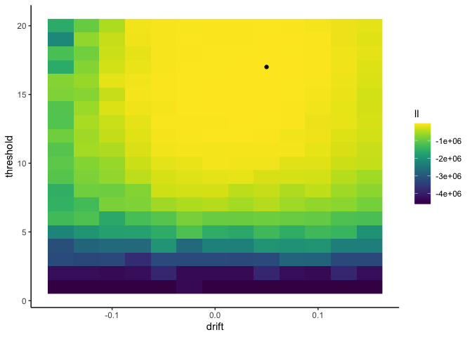
1
ddm_ll %>% arrange(desc(ll)) %>% head(1)
1
2
3
4
## # A tibble: 1 × 4
##   drift threshold ddm_data                      ll
##   <dbl>     <dbl> <list>                     <dbl>
## 1  0.05        17 <grouped_df [5,000 × 9]> -32899.
Here I get a drift rate of 0.05 and a threshold of 17, which is very
close to the true values of .075 and 16!